
This chapter is a reference for the properties in each individual pane class as they appear in the Property Inspector Window.
Every kind of pane has stored data. Some are very simple, others are more complex. You modify and view this data in the property inspector for the individual pane.
This chapter discusses how to work with a property inspector, and how the structure of the window reflects the nature of the pane. The display of data in the Property Inspector Window is highly modular.
The rest of the chapter is a class-by-class reference to the properties for each pane in PowerPlant.
The topics in this chapter are:
In general, the information in this chapter does not tell you the purpose for each data item in a property inspector, or how to use that item to best effect in a PowerPlant application. See The PowerPlant Book for information on class data members, and how to use them in a PowerPlant application.
You open a pane property inspector in Constructor using one of three methods:
The property inspector displays various options that you can modify. The property inspector is, essentially, a modeless dialog box of sorts. You use standard techniques to modify the contents. Use the mouse to change options and enter fields, or navigate through the edit fields with the Tab and Shift-Tab keys.
Changes in a property inspector take effect in the layout and hierarchy windows quickly. Check box and radio button changes show up immediately. Changes in the edit fields appear as soon as you leave the field by pressing Tab, clicking elsewhere on the screen, or closing the property inspector.
When editing, all normal editing functions apply, including Cut, Copy, Paste and Clear. You can navigate through the text with arrow keys. You can extend the text selection by pressing the Shift key as you click the mouse.
You can undo any change that you make by choosing Undo from the Edit menu. The menu item will be either Undo Info Change or Redo Info Change.
With a few exceptions, the property inspector for a particular type of pane reflects its place in the class hierarchy of PowerPlant panes. LPane is the base class for this entire hierarchy, and every type of pane has LPane properties.
Each type of pane usually has additional properties particular to that kind of pane. The items in the property inspector correspond to the data members (including inherited data members) for that pane class in PowerPlant.
For example, Figure 10.1 shows the property inspector for an LCaption object. Notice that the top part of the window has LPane properties, and the bottom part of the window contains the caption-specific data.
Property inspector for an LCaption: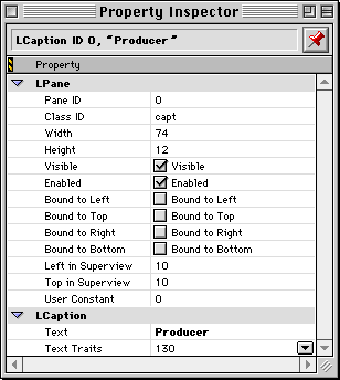
Each property inspector is structured similarly. Properties from LPane appears at the top. Properties specific to the pane appear at the bottom.
In the topics in this chapter, information is presented consistently. The discussion of each class has these sections.
For each class the properties section has an illustration showing the data items specific to that class. Each data item is also explained in a table like this:
| Item |
Specifies |
|---|---|
The actual property inspector for any pane is typically built out of the properties from each ancestor class, and the specific properties for the pane in question. To see all the properties for a pane, refer to the discussion for each ancestor class as well as the specific pane of interest.
For those cases where the property inspector of a pane is not the sum of all ancestor panes, that fact is noted in the description of the properties.
The base class for all visual objects in PowerPlant. A pure LPane is not typically added to a PPob resource.
None. LPane is the base class from which all PowerPlant visual classes descend.
Table 10.2 lists the property inspector for an LPane. Almost all property inspectors display this data at the top of the window.
| Item |
Specifies |
|---|---|
Binding affects the pane both at runtime and in the Constructor layout editor. If binding is on for any given side of a pane, that side of the pane will remain the same distance from the edge of the enclosing view when you resize the view.
The default value for pane ID is zero. You must change the ID
to a unique value if you call FindPaneByID() for the pane. The ID should also be unique if some other pane
refers to this pane by ID, such as the ID number of the view contained
in an LScroller or LActive Scroller. Otherwise, you can leave
the pane ID as zero.
The class ID is used by the URegistrar and UReanimator classes
to build the pane at runtime. It corresponds to the class_ID enum at the start of each display class's header. Constructor
fills this field in for you automatically when you add a pane
from the Catalog Window. If you declare a subclass, you must give it a unique class ID.
PowerPlant reserves all IDs that consist entirely of lower case
letters. Make sure your class ID has at least one upper-case letter.
The PowerPlant view classes represent panes that can contain other panes. Several are typically used to represent data, however, and do not generally contain other panes. All of these classes derive from LPane via LView.
Base class for all view classes. Also, a generic, simple container for other panes, useful for implementing scrolling and grouping panes in logical containers. This may be a top-level view but can also be added to a PPob.
LView -> LPane
Table 10.3 lists the properties specific for LView.
| Item |
Specifies |
|---|---|
A view may have an image larger than its bounds. In that case,
the image may scroll. If the image is scrolled, Reconcile Overhang is on, and the view grows down and to the right beyond the bottom
right of the image, the image will reposition itself to the bottom
right of the view. This also happens if you use SetImageSize() to reduce the image and that operation leaves a gap at the bottom
or right of the view.
You can make an LView a top-level view. See "Creating a Layout Resource."
The PowerPlant Book chapter on views.
A top-level view for a Mac OS window. Can be used for dialog boxes, floating palettes, and document windows.
Table 10.4 lists the properties specific for LWindow. Although LWindow descends from LView and LPane, it has a unique property inspector because of the unique and central importance of a window in the Mac OS.
| Item |
Specifies |
|---|---|
LWindow is a top-level view. You cannot add an LWindow to an existing PPob. You specify LWindow as the top-level view when you create the PPob resource. See "Creating a Layout Resource."
Some of the information you specify is stored in a WIND resource rather than the PPob. Constructor creates and maintains WIND resources for each LWindow and LDialogBox PPob.
Because windows do not have scrollbars (although views inside windows may scroll), LView scrolling properties are not included.
Any negative number in Maximum or Standard sizes will be adjusted to the appropriate size for the screen by the LWindow functions.
The Window Kind pop-up menu allows you to set the type of window for the Mac Toolbox.
This automatically adjusts the WDEF ID field. Options are: Document Window, Modal dialog box, Movable
modal, Modal dialog (no border), Modal dialog (shadow border),
Rounded Window, Floating window, and Floating window (sidebar).
The PowerPlant Book chapter on windows. PowerPlant Advanced Topics chapter on drag and drop.
A top-level view for a dialog box.
LDialogBox->LWindow -> LView -> LPane
Table 10.5 lists the properties specific for LDialogBox. The other properties are identical to LWindow.
| Item |
Specifies |
|---|---|
LDialogBox is a top-level view. You cannot add an LDialogBox to an existing PPob. You specify LDialogBox as the top-level view when you create the PPob resource. See "Creating a Layout Resource."
The PowerPlant Book chapter on dialogs.
A view that enables or disables its subviews based on the setting of its own checkbox.
LCheckBoxGroupBox->LView -> LPane
Table 10.6 lists the properties in LCheckBoxGroupBox. Its other properties are inherited from LView.
| Item |
Specifies |
|---|---|
Draws an appropriate border when its sub pane has the focus using the PowerPlant grayscale appearance.
LGAFocusBorder->LView -> LPane
Table 10.7 lists the properties in LGAFocusBorder. Its other properties are inherited from LView.
| Item |
Specifies |
|---|---|
A top-level view that acts as the interface between PowerPlant panes and "foreign" code that knows nothing about PowerPlant. This allows you to use PowerPlant panes in other Mac OS frameworks or in other code such as HyperCard XCMDs.
Same as LView.
LGrafPortView is a top-level view. You cannot add an LGrafPortView to an existing PPob. You specify LGrafPortView as the top-level view when you create the PPob resource. See "Creating a Layout Resource."
Provides a view to contain a Mac OS 8 image well.
Table 10.8 lists its properties. Its other properties are inherited from LView.
| Item |
Specifies |
|---|---|
Inside Macintosh: Mac OS 8 Toolbox Reference and Inside Macintosh: Mac OS 8 Human Interface Guidelines
A view that contains and scrolls another view. LScroller is not a scroll bar, although the LScroller creates its own scroll bars automatically.
Table 10.9 lists the properties specific for this pane. Although LScroller inherits from LView, the LScroller property inspector does not include LView properties. An LScroller contains another view, and does not require LView properties. It is unlikely that the LScroller will itself be scrolled.
| Item |
Specifies |
|---|---|
A value of -1 for left or top indent means that the corresponding scroll bar does not appear. The default values of 15 pixels for right and bottom allow room for a resize box in the bottom right corner of the view.
To have your views scroll, create an LScroller and put an LView or derived type inside the scroller. The LScroller coordinates the scrollbars that it creates and the scroll position of the image which is contained within it. If you have a number of panes that you want to scroll together, use an LView object to contain them, and put the view inside the LScroller.
When setting the size of an LScroller, typically you set it to extend one pixel beyond the bounds of the view it encloses, on all four sides. The location and size of the LScroller define the outside of the scroller, which should correspond to the outside of the view being scrolled.
The PowerPlant Book chapter on views.
A scrolling view with active update while the user moves the scroll thumb.
LActiveScroller->LScroller -> LView -> LPane
Same as LScroller.
Same as LScroller.
The PowerPlant Book chapter on views.
A view that automatically draws its contents to an offscreen buffer before drawing the image to the screen.
LOffscreenView->LView -> LPane
Same as LView.
Used for drawing to an offscreen bitmap.
The PowerPlant Book chapter on views.
Table 10.10 lists the properties specific for this pane.
| Item |
Specifies |
|---|---|
If the PICT resource is in the same file as the PPob, Constructor displays the picture in the pane.
A PowerPlant wrapper pane for the Mac OS Text-Edit. Useful for simple text processing.
Table 10.11 lists the properties specific for this pane.
| Item |
Specifies |
|---|---|
LTextEdit is a simple wrapper for the Toolbox TextEdit features and suffers from the same limitations, such as a 32K limit on the amoung of text.
LTextEdit supports text in a single style only.
LEditField, The PowerPlant Book chapter on views.
Table 10.12 lists the properties specific for LPrintout. and represents all the data required for an LPrintout. Other pane and view properties are not necessary.
| Item |
Specifies |
|---|---|
LPrintout is a top-level view. You cannot add an LPrintout to an existing PPob. You specify LPrintout as the top-level view when you create the PPob resource.
The PowerPlant Book chapter on printing.
Holds another view for printing.
Table 10.13 lists the properties specific for LPlaceholder.
| Item |
Specifies |
|---|---|
This view is used for printing only. It holds a regular view temporarily, and then returns the occupant to its original location.
The PowerPlant Book chapter on printing.
A view containing cells with data of a single length, all cells the same size, and that allows single cell selection.
Table 10.14 lists the properties specific for LTable.
| Item |
Specifies |
|---|---|
All of the LTable items are 32-bit values.
LTable is being superseded by LTableView, which is more flexible and allows data of varying size.
A very flexible view class that allows for cells containing data of varying length, cells of varying size, and multiple cell selection.
Same as LView.
You vary behavior of an LTableView class by attaching various helper objects.
Refer to LView. See PowerPlant Advanced Topics chapter on tables.
A table with collapsible rows.
LHierarchyTable->LTableView -> LView -> LPane
Same as LView.
Refer to LView. See PowerPlant Advanced Topics chapter on tables.
A hierarchy table containing text data.
LTextHierTable->LHierarchyTable -> LTableView -> LView -> LPane
Same as LView.
Refer to LView. See PowerPlant Advanced Topics chapter on tables.
A table supporting expandable hierarchies.
LOutlineTable -> LTableView -> LView -> LPane
Table 10.15 lists the properties specific for LOutlineTable.
| Item |
Specifies |
|---|---|
Refer to LView. See PowerPlant Advanced Topics chapter on tables.
A table containing small icons.
LSmallIconTable->LTableView -> LView -> LPane
Same as LView.
This is really just a demonstration class of little direct utility.
Refer to LView. See PowerPlant Advanced Topics chapter on tables.
A table with one column, with data of a single length, all cells the same size.
LColumnView->LTableView -> LView -> LPane
Table 10.16 lists the properties specific for LColumnView.
| Item |
Specifies |
|---|---|
In typical use, you would subclass LColumnView to display data of the appropriate type. You cannot use LColumnView directly.
You specify the number of rows at run-time.
When Use Single Selector is off, you can create a multi-selector to support multiple and
discontiguous cell selection.
PowerPlant Advanced Topics chapter on tables.
An LColumnView to display text.
LTextColumn->LColumnView->LTableView -> LView -> LPane
Table 10.17 lists the properties specific for LTextColumn.
| Item |
Specifies |
|---|---|
PowerPlant initializes the table with the contents of the STR# resource.
PowerPlant Advanced Topics chapter on tables.
The control classes represent buttons, check boxes, scroll bars and pop-up menus. All of these classes derive from LPane via LControl.
The property inspectors for several derived control classes include the properties for LControl.
LControl is the base class for all other control classes.
LControl->LPane
Table 10.18 lists the properties specific for LControl.
| Item |
Specifies |
|---|---|
Because LControl does not have a visual representation, it will not be visible in the layout window unless you display pane edges. See "Displaying pane edges."
Constructor automatically makes a RidL resource (list of all the control IDs) for all views that contain controls. You can use this to link listeners (such as Dialog Boxes) to control broadcasters.
The PowerPlant Book chapter on controls.
A generic, standard Mac OS control. LStdControl represents the base class for other standard Mac OS controls, and is used directly for scroll bars.
LStdControl->LControl -> LPane
Table 10.19 lists the properties specific for LStdControl.
| Item |
Specifies |
|---|---|
Some controls, such as scroll bars, have no title. Scroll bars
in PowerPlant are LStdControl objects. The default Control Kind value of 16 represents a scroll bar in the Mac OS Control Manager.
The LScroller class makes its own scroll bars using LStdControl.
You may want to use the LStdControl class when you are working
with a custom CDEF resource. Set the Control Kind field to CDEF ID plus the variation.
The PowerPlant Book chapter on controls.
A standard Mac OS push button.
LStdButton->LStdControl -> LControl -> LPane
Table 10.20 lists the properties specific for LStdButton. The LStdButton property inspector is a combination of these properties and LPane.
| Item |
Specifies |
|---|---|
The Control Kind value for a standard button is 0.
The PowerPlant Book chapter on controls.
LStdCheckBox->LStdControl -> LControl -> LPane
Table 10.21 lists the properties specific for LStdCheckBox. The LStdCheckBox property inspector is a combination of these properties and LPane.
| Item |
Specifies |
|---|---|
The Control Kind value for a check box should be 1.
The PowerPlant Book chapter on controls.
A standard Mac OS radio button.
LStdRadioButton->LStdControl -> LControl -> LPane
Table 10.22 lists the properties specific for LStdRadioButton. The LStdRadioButton property inspector is a combination of these properties and LPane.
| Item |
Specifies |
|---|---|
The Control Kind value for a radio button should be 2.
The PowerPlant Book chapter on controls. For information about radio groups, see "Working With Radio Groups."
A standard Mac OS pop-up menu.
LStdPopupMenu->LStdControl -> LControl -> LPane
Table 10.23 lists the properties specific for LStdPopupMenu. The LStdPopupMenu property inspector is a combination of these properties and LPane.
| Item |
Specifies |
|---|---|
The Title Style and Title Placement options have no effect on the pop-up menu items.
The Title Width specifies the width of the menu title as part of the entire Width field (an LPane data item). The difference between Width and Title Width is the space available for menu items. You may need to experiment
with different widths to display the menu properly at runtime.
You must create a MENU resource that contains the text of the menu items for the pop-up menu.
The PowerPlant Book chapter on controls.
A graphical button containing a PICT or icon.
Table 10.24 lists the properties specific for LButton.
| Item |
Specifies |
|---|---|
Choose a resource type from the pop-up menu. Resource types available are ICN#, ICON, and PICT.
The PowerPlant Book chapter on controls.
A graphical button containing a cicn resource.
LCicnButton->LControl -> LPane
Table 10.25 lists the properties specific for LCicnButton.
| Item |
Specifies |
|---|---|
The PowerPlant Book chapter on controls.
A button with on, off, and transition states.
LToggleButton->LControl -> LPane
Table 10.26 lists the properties specific for LToggleButton.
| Item |
Specifies |
|---|---|
Choose a resource type from the pop-up menu. Resource types available are ICN#, ICON, and PICT.
The PowerPlant Book chapter on controls.
A button with textual rather than graphical content. Typically used as a column head to control sort order.
LTextButton->LControl -> LPane
Table 10.27 lists the properties specific for LTextButton. The LTextButton property inspector is a combination of these properties and LPane.
| Item |
Specifies |
|---|---|
LTextButtons are mutually exclusive buttons and may be added to radio groups. See "Working With Radio Groups."
The PowerPlant Book chapter on controls.
The simple pane classes represent a variety of visual objects. Most derive directly from LPane. All of them derive from LPane without inheriting from either LView or LControl.
LIconPane->LPane
Table 10.28 lists the properties specific for LIconPane.
| Item |
Specifies |
|---|---|
The LIconPane is for display only. It does not respond to clicks. To use an icon in a button, see LButton, LCicnButton, or LToggleButton.
The PowerPlant Book chapter on panes.
A pane containing static text.
LCaption->LPane
Table 10.28 lists the properties specific for LCaption.
| Item |
Specifies |
|---|---|
The PowerPlant Book chapter on panes.
A titled frame that groups a set of elements visually.
Same as LCaption.
The PowerPlant Book chapter on panes.
An editable text field, typically in a dialog box.
LEditField->LPane
Table 10.30 lists the properties specific for LEditField.
| Item |
Specifies |
|---|---|
To ensure that the field big enough to fit the data, set the text traits and then type in the longest expected data. You can see the result in the layout window.
The available key filters are: None, Integer, Alpha-numeric, and Printing Character. See The PowerPlant Book chapter on utilities for information on key filters.
The Text Buffering, Inline Input, and Text Services features are used for two-byte character sets and ideographic
languages.
The PowerPlant Book chapter on panes. See LTextEdit for scrolling text fields.
For information on topics such as inline input and text services, see Inside Macintosh: Text.
A pane containing a single-column Mac OS List Manager list.
LListBox->LPane
Table 10.31 lists the properties specific for LListBox.
| Item |
Specifies |
|---|---|
LListBox is a wrapper for the Mac OS List Manager. LTableView classes are more flexible.
PowerPlant allows multiple columns. However, you must add them programmatically with the Mac Toolbox. These lists come with their own scrollbars. You should not implement them in Constructor or PowerPlant.
The PowerPlant Book chapter on panes.
You regularly declare and define custom classes derived from the PowerPlant visual hierarchy. A custom class may have modified or additional behaviors (member functions) and/or additional data members.
If a custom class has no additional data members, you can use the standard Constructor panes to represent the class. When you set the properties for that pane, simply modify the Class ID field to reflect the Class ID you declared for your custom class. See "Simple Custom Panes."
If a custom class has additional data members, you can add them to the property inspector easily. Essentially, you create a CTYP resource. When that resource is available to Constructor, that pane appears in the Catalog Window. See "What a CTYP Resource Does."
You can then use the pane just like any other pane.