This chapter discusses the tools you use and the tasks you perform to modify the contents of a view (window) using Constructor.
We are at the core of what Constructor is all about. You want to quickly and easily specify the appearance of a view and all of its contents. You can do so with Constructor.
This chapter discusses how to manage and modify the contents of windows and views described in a PPob resource. For information on how to create, copy, modify, open, and delete PPob resources as a whole, see "Managing Resources Overview."
The terminology in this chapter is important, and can be confusing. You will be using windows to create windows. You will have views that contain views. To minimize this confusion, here are a few terms and how they are used in this chapter.
With the definition of terms out of the way, we can turn to the real subject at hand. Conceptually, this chapter consists of two sections: what you see and what you do. The "what you see" section explains the Constructor windows involved in editing a view. The "what you do" section discusses the tasks you perform. The topics are:
Windows for Views-the windows you use to display and set PPob-related information
Building a Visual Interface-the tasks you perform to build a PPob and its contents
This section discusses the Constructor windows involved in creating a PPob and its contents. The principal features and characteristics of each window are discussed in detail. This section covers what you see in Constructor. The topics include:
In addition, you examine pane properties in the Property Inspector Window. There is one Catalog Window and one Property Inspector Window for Constructor shared by all PPob resources. However, each PPob resource has its own Layout Window and Hierarchy Window.
The PowerPlant Catalog Window contains every class related to visual objects-that is, objects you can display. This window contains standard PowerPlant classes and custom display classes. It is the catalog you use as a source for new panes when building a PPob. See "Adding Panes to a PPob."
To open this window, choose the Catalog item in the Window menu. This window shows the class name and the class ID for each
pane.
The panes are organized into groups defined by a PowerPlant base class. The groups are:
To see the contents of a particular group of panes, click the corresponding tab in the scrolling bar across the top of the window.
You can view the panes by class hierarchy, as shown in Figure 4.1, or sort the panes by name. Click the List Button at the top of the vertical scroll bar to switch between hierarchy and name order.
The PowerPlant Catalog window: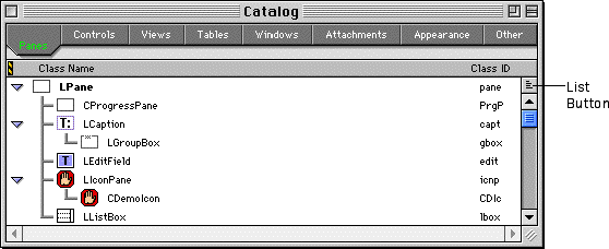
The layout window is where you do most of your visual work in Constructor. This is the window in which you arrange your panes for functional and aesthetic appearance.
When you open a PPob resource, the layout window for that resource appears. You may open the layout window in three ways:
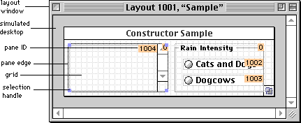
Figure 4.2 shows a layout window. The PPob appears on a simulated desktop inside the layout window.
The title bar of the layout window shows the nature of the resource, the resource ID number, and the name of the resource. In this case it is a PPob resource, ID number 1001, and named "untitled."
Within the layout window there is a PPob. In this case the top-level view is an LWindow. If you have a PPob whose top-level view has a title bar (such as an LWindow), you can see the title in the layout view. You can change the size of a top-level view by dragging a selection handle.
The nature of the top-level view depends on the view type you select for the PPob resource when you create it. Typically the top-level view is an LWindow, LView, LPrintout, LGrafPortView, LDialogBox, or LGADialog. See "Creating a Layout Resource."
 TIP
TIP You can't change the top-level view type after you have created the PPob resource. If you want to change the top-level view, make a new resource with the correct view type. Then copy the contents of the original view to the new view.
As you add panes to the PPob, you can rearrange them in the layout window, modify them, resize them, and so forth. See "Building a Visual Interface."
The hierarchy window is an alternative but critical method of visualizing a PPob and its contents. Panes in a PPob are arranged both spatially and hierarchically. A pane that is visually inside another pane may or may not be contained hierarchically within that pane.
The containment hierarchy is an important aspect of PowerPlant programming. Sometimes it is vital that a pane be hierarchically contained inside another pane. For example, if you have a picture that you want to scroll, the LPicture pane must be hierarchically located inside a scrolling view pane.
The containment relationships among panes is stored in the PPob resource, along with all the other pane-related information. PowerPlant use this information to set up the superview/subview relationships in the PowerPlant objects at runtime.
The hierarchy window displays the containment hierarchy for a
PPob. To display a PPob's hierarchy window, choose the Show Object Hierarchy item from the Layout menu, when that PPob's layout window is active. The layout window
must be open to view the hierarchy window.
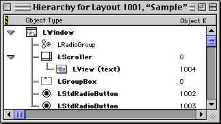
Figure 4.3 shows a hierarchy window.
The top-level view is always at the top of the hierarchy window. When you select an item, the hierarchy lines become darker. In this case, the LTextEdit pane is contained within an LScroller pane, and that is inside the LWindow pane that forms the top-level view.
 NOTE
NOTE The hierarchy window also shows you the order in which panes will be drawn. Your application will draw from the top of the hierarchy down. Panes further down the list may hide those higher up if they overlap and draw over the same area.
You use the hierarchy window to rearrange the hierarchical order of the panes in a PPob. See "Arranging Panes Hierarchically."
Constructor maintains a single PPob resource for each top-level view. The PPob contains all the data on all the panes. The layout and hierarchy windows are simply different views on the same data set.
The layout window specializes in viewing the spatial relationships among the panes in a PPob resource. You can see what they look like relative to each other, move them around, and so forth. You use the layout view to arrange the visual appearance of a PPob.
The hierarchy window specializes in viewing the containment relationships among the panes in the PPob resource. You can see which panes actually contain other panes.
Either window provides access to the data in the PPob resource. Each looks at the data a little differently. However, you can use either view-layout or hierarchy-as a source or destination when copying panes between projects. For example, you can copy a pane from a layout window in one project, and paste it into the hierarchy window in another project.
Except that each window has a special way of viewing the PPob data, the layout and hierarchy windows are interchangeable. If you cut an item in the hierarchy window, it disappears from the layout. If you copy an item in the layout, it appears in the hierarchy. Constructor keeps both windows updated and consistent at all times.
This section discusses the individual tasks you must perform when editing a PPob resource. You must add panes to a PPob, arrange them visually and hierarchically, create certain groups, and set properties for the panes. For information on how to create a new PPob resource, see "Creating a Layout Resource."
These tasks are not sequential. You perform these tasks concurrently, and in virtually any order that fits your personal style. However, at one time or another you will perform each task while creating a PPob.
The topics in this section are:
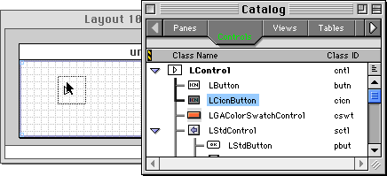
To add a pane to a PPob, you copy a pane from some other source and move it into the PPob. The most common method is to drag a pane from the Catalog Window into a PPob. Figure 4.4 illustrates the process of adding an LCicnButton to a PPob.
You can drop panes only into a PPob. Constructor does not let you drop them on the simulated desktop around the PPob.
A new pane created by dragging from the Catalog Window always starts out with a default size and default attributes. For example, panes designed for text are usually empty-that is, they have no text in them. You modify the pane after adding it to the PPob. See "Setting Pane Properties."
NOTE You cannot copy from the Catalog Window and paste into a PPob. You must drag from one to the other.
You can copy and paste panes within a PPob or between PPobs. You use the standard techniques for copy and paste. See "Moving, Copying, and Deleting."
When working in the layout window, you can control the display of certain pane characteristics. Use menu commands for:
Each pane has a pane ID. PowerPlant uses the pane ID to find the pane object in memory. You set the pane ID in the Property Inspector Window.
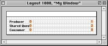
To display ID numbers, choose the Show Pane IDs command in the Layout menu. The ID of each pane appears. When the IDs are being displayed,
the menu item text changes to Hide Pane IDs. Choose Hide Pane IDs to conceal the ID numbers. Figure 4.5 shows pane IDs on display.
See The PowerPlant Book for information on how to use pane IDs.
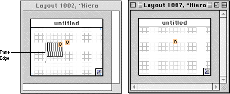
Every pane has a boundary or edge. However, some pane types have no actual visual representation. For example, an LView pane is simply a container for other panes. If pane edges are hidden, you cannot see an LView object in the layout window. If you show pane edges, you can see the dotted outline of the LView pane.
To display pane edges, choose the Show Pane Edges command in the Layout menu. The bounds of each pane appear as a dotted outline. When
edges are being displayed, the menu item text changes to Hide Pane Edges. Choose Hide Pane Edges to conceal the edges.
Figure 4.6 shows two PPobs, each with an LView object with ID zero. The ID number is on display. In the window on the left, the pane edge is visible. In the window on the right, the pane edge is hidden, so the pane bounds are invisible. If you hide both pane ID and edges, the LView object would be completely hidden. You could still select it, but you couldn't see it except for the selection handles while it is selected.
Showing edges is also useful for panes that contain an icon or picture, or for panes that do not have a visual frame. The image might be smaller than the actual pane size. If you display pane edges, you can see the actual size of the pane. Figure 4.7 illustrates this feature. This PPob contains an LButton pane that uses a very small picture.
A picture smaller than a pane: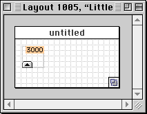
Each pane has a Visible check box in the Property Inspector Window. You use this pane attribute to determine whether a pane is visible
or not at runtime. However, Constructor reads the same attribute
and allows you to show a pane even if it is intended to be invisible
at runtime.
To show non-visible panes, choose the Show Invisible Panes command in the Layout menu. Choose Hide Invisible Panes to conceal the non-visible panes once again.
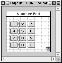
Some panes contain an icon or picture. For example, an LButton pane references a set of PICT resources. If you have the icon or picture resource in the same file as the PPob resource, Constructor displays the actual icon or picture in the layout window. Figure 4.8 shows some pictures on display inside button panes.
Keeping icon and picture resources in the same file as the PPob can make editing the layout window a lot more intuitive. You can see the contents of the item, not just an empty rectangle. You can even edit the icons or pictures in Constructor. See "Editing Bitmaps Overview."
This section discusses the various techniques you can use to arrange your panes in a visually pleasing and aesthetic pattern within a PPob. Constructor has features for:
Most operations require that you first select the pane or panes on which you wish to work, and then do something to them. You select panes in the usual ways: click, Shift-click to extend a selection, or click and drag using the marquee. You can begin a marquee selection inside an existing pane if you hold down the Control key when you start the drag. See "Selection."
You select a pane using standard selection techniques. See "Selection." However, you may have panes stacked on top of each other such that one pane completely covers (and thus obscures) a pane behind it.
If you have one pane on top of another, you can select the item behind the currently selected item by holding down the Command key while clicking. To select the next item in the stack, Command-click again. This cycles through the stacked panes, including the top-level view, without affecting any other panes. Continue Command-clicking until you have selected the desired pane.
NOTE If you have Command-clicked to select an obscured pane, you must hold down the Option key before dragging, resizing, or double-clicking that pane to prevent Constructor from changing the selection.
To move a pane, drag the selection with the mouse and drop it at the desired location. You can select and drag multiple panes as well. You may also use the Property Inspector Window to change the pane's location.
Hold down Shift and/or Command keys while dragging to constrain the movement of the pane.
To constrain the movement to the same horizontal or vertical line, press the Shift key after you start dragging. This allows you to move a selection in a straight line. If you let go of the Shift key, the constraint is released and you can move the selection freely.
NOTE Holding down the Shift key while selecting allows you to extend the selection.
To constrain the movement to a grid, you choose the Snap to Grid command in the Layout menu. To reverse the snap setting temporarily, press the Command
key after you start dragging. If you let go of the Command key, the snap
setting is determined from the menu.
NOTE Holding down the Command key while selecting allows you to select a pane behind the front pane.
There is one pane you cannot move. You cannot move a top-level view. The top-level view stays anchored in the layout window. You can reposition the location at which your top-level view will appear in the desktop when you run your application. You do that by setting the location in the Property Inspector Window for the top-level view. See The PowerPlant Book for details on positioning windows.
Sometimes you want to move a pane by one or two pixels. It can be difficult to be this precise dragging with the mouse.
To nudge a pane, first select the pane. Then use the cursor control keys (the arrow keys) to move the pane in the desired direction: up, down, left, or right. Each time you type an arrow key, the pane moves by one pixel in the corresponding direction.
Constructor has a grid you can use to arrange panes. You can display the grid, snap to the grid, and modify the grid spacing.
To see the grid, choose Show Grid from the Layout menu. To conceal the grid, choose Hide Grid. Figure 4.9 shows a 10-pixel square grid in an empty PPob.
The Constructor grid on display: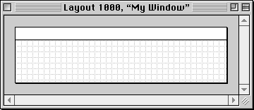
If you want all panes to align along grid lines, choose the Snap To Grid command from the Layout menu. To allow free movement, choose Don't Snap To Grid. These commands have no effect on existing panes. The snap to
grid comes into play when you drag panes. If the snap feature
is on, the drag outline snaps to the grid while you drag an item.
The snap feature works whether or not the grid is visible.
TIP You can reverse the snap to grid setting when dragging panes. Hold down the Command key after you start dragging.
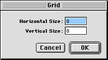
You can set the grid spacing (in pixels). Choose the Edit Grid item in the Layout menu. The Grid dialog appears as shown in Figure 4.10. Enter the grid spacing you want. You can have different values
for horizontal and vertical spacing.
You can align selected panes in the layout very easily. Constructor has three mechanisms for aligning panes: menu commands, a palette, and a dialog. All three mechanisms have similar functionality for aligning panes.
First, select two or more panes you wish to align. Then issue the command for how you want to align the panes. You may:
The alignment options, corresponding icons, and results are listed
in Table 4.1. These correspond to menu commands in the Arrange menu, and buttons in the palette and the Arrange Objects dialog.
Constructor pane alignment options:
| Option |
Icon |
Alignment Line |
|---|---|---|
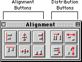
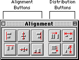
To see the alignment palette, choose Alignment Palette from the Window . Figure 4.11 shows the alignment palette, with the six alignment buttons on
the left side of the palette. The other buttons are for distributing
panes. See "Distributing panes."
Simply click the appropriate button to obtain the desired alignment. The effect is immediate. Like most operations in Constructor, you can undo the action if you wish.
The third alternative for aligning panes in Constructor is the
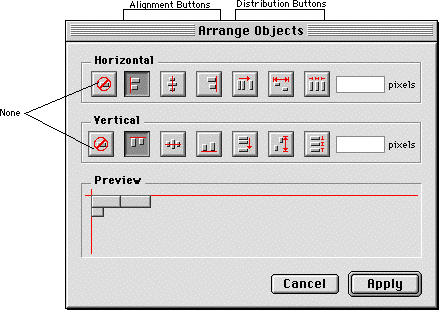
Arrange Objects dialog. When you choose Arrange Objects from the Arrange menu, Constructor displays the dialog shown in Figure 4.12. This dialog gives you a few alignment options not available
with the alignment palette.
The Arrange Objects dialog lets you set both a horizontal and vertical alignment simultaneously, and lets you preview the effect of a command. The preview in the illustration shows objects aligned along top left edges.
Simply click the desired horizontal and vertical alignment. When you have set the desired alignment option, click the Apply button. The dialog disappears and your command is applied to the selected panes. Constructor remembers the previous settings in the Arrange Objects dialog and restores them when you open the dialog again.
Distributing panes means to spread them out evenly across a certain distance. Evenly means that after distribution, the gap between each pair of panes is the same.
You can distribute selected panes in the layout very easily. Constructor has three mechanisms for distributing panes: menu commands, a palette, and a dialog. The dialog has additional features not available from menu commands or the alignment palette.
First, select two or more panes you wish to distribute. Then issue the command for how you want to distribute the panes. You may:
Arrange menu
Arrange Objects from the Arrange menu
The distribution options, icons, and results are listed in Table 4.2. Some of these correspond to menu commands in the Arrange menu, and buttons in the alignment palette. The Arrange Objects
dialog has all six options.
Constructor pane distribution commands:
| Option |
Icon |
Range of spread |
|---|---|---|
When distributed, panes maintain their original left to right or top to bottom ordering, based on the left or top edges respectively.
You cannot specify a gap using the alignment palette or menu commands. You can specify a gap in the Arrange Objects dialog.
When distributing in a container, you must pay attention to the containment hierarchy. If all panes are in the same container (such as a scrolling view, for example) then it is that container's bounds that serve as the range within which the panes are distributed. If panes are in multiple containers, the bounds of the container that holds all the selected panes controls distribution.
Figure 4.13 shows the alignment palette, with four distribution-related buttons on the right side of the palette. The other buttons are for aligning panes. See "Aligning panes."
Simply click the appropriate button to obtain the desired distribution. The effect is immediate. Like most operations in Constructor, you can undo the action if you wish.
The third alternative for distributing panes in Constructor is
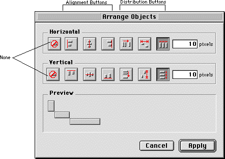
the Arrange Objects dialog. When you choose Arrange Objects from the Arrange menu, Constructor displays the dialog shown in Figure 4.14. This dialog gives you a few distribution options not available
with the alignment palette.
The Arrange Objects dialog lets you set both a horizontal and vertical distribution simultaneously, and lets you preview the effect of a command. The preview in the illustration shows objects distributed with a 10-pixel gap both horizontally and vertically.
You may also provide a set gap or space to use between panes.
To specify a gap, click the appropriate button. When you do, the
pixels field associated with that button becomes enabled so you can
enter the desired spacing.
When you have set the desired distribution options, click the Apply button. The dialog disappears and your command is applied to the selected panes. Constructor remembers the previous settings in the Arrange Objects dialog and restores them when the dialog opens.
To resize a pane or panes, click on one of the selection handles and drag it in any direction. You may also open the Property Inspector Window to change the width and height. You can change the size of a top-level view just like any other pane.
TIP Binding affects a pane both at runtime and in the layout editor. If binding is on for any given side of a pane, that side of the pane will remain the same distance from the edge of the enclosing view when you resize the view.
When you add a pane to a layout, if the drop point is inside a containing pane (a view pane of some type such as LScroller or LView), then Constructor automatically places the new pane inside the container, not only visually but hierarchically as well.
Figure 4.15 shows the result of dropping an LToggleButton pane inside an existing LView object. Notice in the hierarchy window how the button pane appears hierarchically inside the LView pane.
Dropping a pane in a container: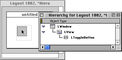
Notice that in the layout window you cannot tell whether the LToggleButton is actually contained in the view. They could simply overlap. The hierarchy window shows you the containment relationship. There is no way you can tell the hierarchical relationship of these two panes by looking at the layout window.
On the other hand, the hierarchy window is designed so that you can easily see and modify the pane hierarchy.
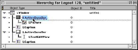
To change a pane's position in the containment hierarchy, select the pane in the hierarchy window, and drag it to a new position anywhere in the hierarchy. While you drag, a small focus bar and arrow indicate the current destination, as shown in Figure 4.16. The focus bar flashes to enhance visibility.
In this illustration, the user is changing the selected object's container from one view to another view. This does not change the object's spatial position in the layout. However, because Constructor draws objects clipped to the containing view, the object may appear to have vanished from the layout view. To see the object, increase the size of the new container view to include the area of the object you moved.
You can reorganize multiple panes simultaneously by selecting and dragging them as a unit.
NOTE Dragging a container operates on the container and subpanes as a unit, rather than just the container. Constructor outlines the subpanes as well as the container, so you can tell what you are moving.
You create a radio group to manage a set of mutually-exclusive buttons, such as standard radio buttons, in which one and only one button must be on at one time. See The PowerPlant Book for information about how to use radio groups in PowerPlant code.
To create a radio group, drag an LRadioGroupView object from the Catalog Window and drop it onto its containing view, then drag and drop radio button objects into the LRadioGroupView. Constructor will automatically arrange the radio button objects within the view's hierarchy so that they are in the LRadioGroupView object.
You can work in either the Layout Window or the Hierarchy Window when creating the group. You can see the radio group in the hierarchy window as shown in Figure 4.17.
A radio group in a hierarchy window: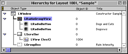
Although these methods are supported, using a LRadioGroupView object is the recommended way to create a radio group.
Alternative ways to create radio group boxes:
Make Radio Group item from the Arrange menu
To see which buttons are contained within a group, use the Hierarchy Window for the radio group, shown in Figure 4.17.
You can add radio buttons to and remove buttons from an existing group. To add a button, select an existing radio button entry in the Property Inspector Window and choose New Radio Button ID from the Edit menu. Then enter the ID number of the radio button you wish to add. To remove a button, simply select it and delete it.
If you create a radio group by dragging the object from the Catalog Window, the group will be empty (even if you have radio buttons selected). To add buttons to the group, use the technique described above.
In many PPob resources, a radio group is visually placed inside an LGroupBox pane, as in Figure 4.18. The LGroupBox pane is simply a visual feature of the layout. It has nothing to do with radio groups.
Radio buttons inside an LGroupBox pane: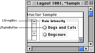
You may also note from the illustration that Constructor does not show any button in the group as being on. PowerPlant takes care of this at runtime. You can specify which button should be on by default in the Property Inspector Window. See The PowerPlant Book for details.
You create a tab group to manage a set of editable text fields when you want to allow the user to move from one field to the next by typing the Tab key. This is a common feature of dialog boxes that have editable text fields.
To create a tab group, choose the Make Tab Group item from the Arrange menu. The tab group object does not appear in the Layout Window because is has no visual counterpart. It does appear in the Hierarchy Window as shown in Figure 4.19.
A tab group in a hierarchy window: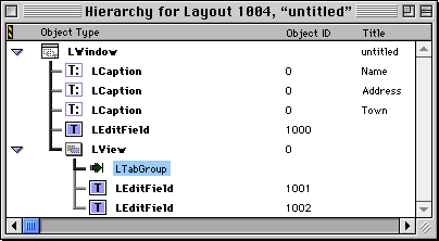
Drag the tab group object to any location in the hierarchy. A tab group automatically encompasses all objects at the same level in the visual hierarchy-its siblings. The only way to control membership within a tab group is to put both the desired member panes and the tab group inside some other visual container so they are all on the same level, and other objects are not. For example, in Figure 4.19 two edit fields are in a tab group, but one is not.
A tab group includes all panes at the same level, but it only has impact on panes that are also commanders, such as text-related panes like LEditField and LTextEdit.
 WARNING!
 The text field in the tab group gets the tab key first. Unless
it passes the keypress to its supercommander, (typically the tab
group object), the tab group will not work correctly. LText-Edit,
LEditField, LTextEditView, and LEditText do this properly unless
the key filter selected for the pane is None.
You can connect attachments to panes in your layout. Simply drag the correct attachment from the Catalog Window and drop it into either the Layout Window or Hierarchy Window at the appropriate spot. For example, drop the attachment onto the pane to which you want it attached.
To set the attachment's properties, use the Property Inspector Window show in Figure 4.20. See The PowerPlant Book chapter "Periodicals and Attachments" for information on using attachments.
Inspecting attachment properties: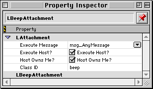
The Property Inspector Window allows you to see and modify an individual pane's data, such as location, size, content, and so forth. You open a property inspector using one of these methods:
You can perform these tasks in either the Layout Window or the Hierarchy Window. Once the Property Inspector is open, it displays the information for the currently selected pane. If multiple panes are selected, it displays information for the first pane selected.
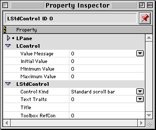
Because each different class of pane has different properties, the precise information in the window depends upon the nature of the selected pane. For example, Figure 4.21 shows the property inspector for the LStdControl class.
The information in the Property Inspector is grouped according to the base class. For example, the LStdControl class derives from LControl ,which derives from LPane. For an LStdControl object, the Property Inspector displays data from each of the three classes, grouped by class.
The Property Inspector Window presents all the customizable properties for that particular kind of pane. When a particular property is irrelevant to a pane, the Property Inspector does not display that property. For example, LStdControl has a minimum and maximum value. LStdButton derives from LStdControl, but a button does not use the minimum or maximum values. So those properties are not available in the inspector window for LStdButton.
See "Property Inspector Window."
For information on the effect or purpose of the various settings, see The PowerPlant Book and "Pane Properties Overview."
To remove a pane from a PPob resource, first select the pane or panes you want to remove. Then you may:
Items dragged to the trash are deleted immediately. They cannot be recovered from the trash. However, a delete operation can be undone until you issue a new command.
Items that are cut from the PPob are placed on the clipboard (remain in memory available for pasting) until a subsequent cut or copy operation.