This chapter discusses how to edit a custom type (CTYP) resource.
You will regularly create visual panes based on custom classes derived from PowerPlant. Some of these custom classes will have additional data members. The Constructor property inspector will display the data for your custom class. You can then set the default or initial properties for the custom pane in exactly the same way you would for a standard PowerPlant pane.
This chapter discusses how to manage and modify the contents of a CTYP resource that describes the data items in a custom pane. For information on how to create, copy, open, modify, and delete a CTYP resource as a whole, see "Managing Resources Overview."
The main topics in this chapter are:
As of Constructor 2.4, CPPb resources are no longer supported. The new resource type (with a different internal storage format) is CTYP. The CTYP resource format will allow for new features in the future.
CPPb resources must be converted to CTYP resources using the converter application supplied with Constructor. The name of this application is Make CTYP. Drop any resource file that contains a CPPb resource onto this converter, and it will automatically generate corresponding CTYP resources. The original CPPb resource will remain in the resource file.
This section examines the purpose, benefits, and limitations of the CTYP resource architecture in Constructor.
The topics in this section are:
When you edit a CTYP resource, you define what the Property Inspector Window will look like for your custom pane. The CTYP resource specifies the class name, class ID, and additional data types for a custom type. Based on that information, Constructor displays all the necessary fields so you can set the custom data when you open the property inspector for that pane.
Figure 9.1 illustrates a hypothetical CTYP resource for a CDemoIcon pane.
A typical custom type resource: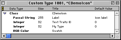
This resource defines three new data items for a custom pane. Instead of just a plain icon, this icon has a label. The pane has a text traits ID to describe the appearance of the label text. And there is a third data item that specifies a special value associated with this icon.
After you create such a resource, Constructor adds the corresponding pane to the Catalog Window. You can then add the CDemo-Icon pane to any layout resource. If you then open the pane property inspector, what you see is illustrated in Figure 9.2.
The property inspector for a CDemoIcon: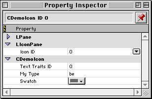
Based on the information in the CTYP resource illustrated in Figure 9.1, Constructor has created a pane property inspector that contains the three new data items: Label, Text Traits ID, and My Type. You can now enter values for these items just like you could for a standard PowerPlant pane.
When Constructor launches, it looks in its own directory for resource files it has created. In those files, it looks for CTYP resources. When Constructor finds a custom type resource, it adds that pane to the Catalog Window.
You can create CTYP resources and save them in one or more resource files in the same folder as Constructor. When Constructor launches, it recognizes the file, reads the data from the CTYP resources, and adds them to the Catalog Window.
Use this technique to create sets of CTYPs that are globally available to every Constructor project you open. This allows you to create libraries of custom types that are always available for easy use.
 WARNING!
 Constructor loads the files alphabetically. If you have a custom type that uses a CTYP in another file as its parent class, and the parent CTYP loads after the child CTYP, the child CTYP will not appear in the Catalog Window because Constructor doesn't know about the parent class. To avoid this problem, rename the files so they load in the proper order.
There are some things that the CTYP resource doesn't do for you.
If a custom type has additional data items, the stream constructor for that class must read these additional data items from the PPob resource and initialize the appropriate data members.
You are limited to the data types offered. There are three basic types:
A simple custom pane represents a class derived from a standard PowerPlant visual class, but with no additional data members.
If a custom class has no additional data members, use the standard PowerPlant panes to represent the custom class in Constructor. There is no need to create a CTYP resource for the custom class.
For example, let's say you declare a class named CMyToggleButton that derives from LToggleButton. CMyToggleButton declares no additional data members, it just overrides LToggleButton behavior.
When you want to add a CMyToggleButton pane to your view, use the LToggleButton pane in Constructor. When you set the pane properties, change the class ID for the pane to whatever the class ID is for the CMyToggleButton class. Set the other properties as appropriate for your CMyToggleButton pane. You can use the standard PowerPlant pane because the properties are identical.
When you open a CTYP resource, the editor window for that resource appears. You may open the editor window in three ways:
Edit Resource from the Edit menu
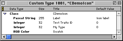
Figure 9.3 shows the CTYP editor window with a typical CTYP resource.
The grey bar in the editor window contains the column heads for the data in the window. The first line of information contains the name of the class.
The editor window displays three columns of information. The data type is not editable. That is set when you create the data item. The Size, Title, and Default Value is editable in place for all data items. The class title is editable as well.
To learn how to add or remove data items from the class, see "Editing a Custom Type Resource".
You use the standard Property Inspector Window to examine and modify the properties for the class, or the individual data items. For more on these issues, see:
"Setting Class Properties" "Setting Data Item Properties"
A custom type resource describes the data items unique to a custom class. The available data types for these items are:
This section discusses the individual tasks you must perform to edit a CTYP resource. These tasks include:
Adding a Data Item Reordering Data Items Removing a Data Item
For information on how to create a new CTYP resource, see "Creating a Custom Type Resource."
For information on how to modify class properties, such as the class name or inheritance, see "Setting Class Properties."
For information on how to modify data item properties such as size, title, or visibility, see "Setting Data Item Properties."
For an example of how to create a CTYP, see the code exercise for Chapter 8, "Controls and Messaging" in The PowerPlant Book.
The data items in the CTYP resource correspond to data members in your custom type class. The items you add to the CTYP resource appear in the pane property inspector for the custom type.
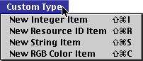
To add an item to a CTYP resource, make sure the Custom Type Editor Window is active. When it is, the Custom Type menu appears in the menu bar. Use this menu to choose the type of data you wish to add. Figure 9.4 shows the choices available.
The new item appears after the currently selected data item, or at the end of the data items if there is no selection.
You may also copy, paste, duplicate, and Option-drag to copy one or more items.
You may add as many items as you wish. However, the property inspector window can become unwieldy if you add many items.
The order of items in the CTYP editor window determines the order in which items appear in the pane property inspector. To modify the order, simply drag an item to a new location.
You can also change the order of data items using cut and paste. A pasted item is placed in the list after the currently selected item.
 NOTE
NOTE The top entry for the class cannot be moved. It is always at the top of the list.
To remove one or more data items from the CTYP resource, first select the item or items. Then you can:
The items disappear from the resource. As with most Constructor actions, you can undo this operation.
NOTE You cannot delete the class from the CTYP editor window. To delete the class, you must go to the Constructor Project Window and delete the resource. The class listing in the CTYP resource is really a reference to the resource itself.
You use the class property inspector to set class-related data. To open this window, you:
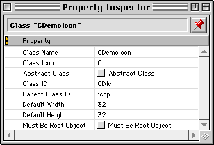
When you do, the window in Figure 9.5 appears.
Table 9.1 lists the purpose of each item in this window.
| Item |
Specifies |
|---|---|
|
|
An abstract class cannot be added to a layout. However, the abstract class will appear in the Catalog Window (in red) in hierarchy view so you can see the inheritance chain.
A root object is one which cannot be contained within another view. Examples of PowerPlant classes that are root objects include LWindow, LDialogBox, LGrafPortView, and LPrintout.
Setting the Class Name and ID Setting Class Inheritance Setting Custom Pane Size
The class name and ID appear in the Catalog Window. The Class ID field holds the four-character code that identifies this class. PowerPlant reserves codes that are all-lowercase for internal use. If you use all lowercase letters, Constructor will warn you. You should use at least one uppercase letter or number for your class ID.
You can edit the class name in place in the Custom Type Editor Window. Select the class name, and enter edit mode. You can do this by clicking on the class name and waiting one second. You may edit the class name in the class property inspector as well.
To modify the class ID, open the class property inspector and edit the Class ID Field. You can open the class property inspector by double-clicking the class in the Custom Type Editor Window.
The class inheritance for the custom pane class determines where in the Catalog Window the custom pane appears. It also determines what data will appear in the pane property inspector, because Constructor builds the pane property inspector out of properties for each ancestor class.
You must specify the immediate base class, not a distant ancestor. To specify the base class, open the class property inspector. Edit the value in the Parent Class ID field. You can open the class property inspector by double-clicking the class in the Custom Type Editor Window.
 TIP
TIP The Catalog Window lists the class ID for each class. It makes a handy reference for class IDs when setting the parent class ID.
When you drop a pane into a PPob resource, it has a default size. Your custom pane has a default size as well.
To modify the pane size, open the class property inspector and edit the Default Width and Default Height fields. You can open the class property inspector by double-clicking the class in the Custom Type Editor Window.
Each data item has a unique set of properties. To edit the size, title, or default value of any item, you can use the Custom Type Editor Window and edit the value in place. You may also edit these properties in the Property Inspector Window for the item.
Each data item has additional properties. To edit these properties, you must use the property inspector. To open this window you:
For details on the properties for each data type, see:
Editing String Properties Editing Integer Properties Editing RGB Properties
The string data item represents a Pascal-style string-one with a length byte followed by the contents of the string. Figure 9.6 shows the string property inspector. Table 9.2 lists the purpose of each property.
The string property inspector: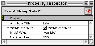
String properties:
| Item |
Specifies |
|---|---|
If you turn off the visible attribute, the item does not appear in the property inspector. This prevents you from modifying the default value for the string. You might want to do this to initialize a data member in the class to a constant value.
Figure 9.7 shows the integer property inspector. Table 9.3 lists the purpose of each property.
The integer property inspector: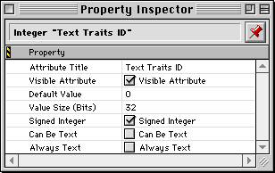
Integer properties:
| Item |
Specifies |
|---|---|
If you turn off the visible attribute, the item does not appear in the property inspector. This prevents you from modifying the default value for the string. You might want to do this to initialize a data member in the class to a constant value.
If the Value Size is one bit, Constructor treats the item as if it were a Boolean and displays a check box in the property inspector. The Value Size property must be in the range 1-32.
The text value items control how you can enter data. If these are off, only numbers are allowed in the entry. However, you may wish to have the opportunity to enter data as a string of characters rather than digits. This is particularly true of the OSType data type, which is a string of four characters stored in a 32-bit integer.
Figure 9.8 shows the resource ID property inspector. Table 9.4 lists the purpose of each property.
The resource ID property inspector: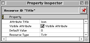
Resource ID properties:
| Item |
Specifies |
|---|---|
If you turn off the visible attribute, the item does not appear in the property inspector. This prevents you from modifying the default value for the string. You might want to do this to initialize a data member in the class to a constant value.
Figure 9.9 shows the RGB property inspector. Table 9.5 lists the purpose of each property.
The RGB property inspector: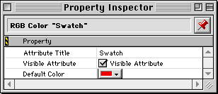
RGB Color properties:
| Item |
Specifies |
|---|---|
If you turn off the visible attribute, the item does not appear in the property inspector. This prevents you from modifying the default value for the string. You might want to do this to initialize a data member in the class to a constant value.