This is the third and last chapter in the Basic Building Blocks section of the manual. In the previous two chapters we discussed panes and views. In this chapter we talk about the third and final group of pane classes, LControl and its descendants.
The principal topics in this chapter are:
After we complete this discussion, you'll create and manipulate real controls in this chapter's coding exercise.
From the point of view of the Mac OS, a control is a visual interface device with which the user controls the machine. Radio buttons, check boxes, popup menus, and so forth, are all controls.
From the PowerPlant point of view, a control is an object of any class that inherits from the LControl class. In the control classes, PowerPlant provides all of the standard controls you find in the Mac OS, and a few others as well.
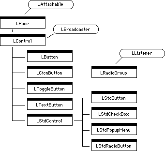
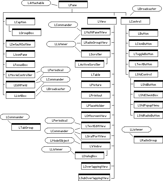
Figure 8.1 shows the class hierarchy for the PowerPlant control classes.
Notice that the LControl class inherits from LBroadcaster. This is the most significant difference between a control and any other kind of pane. All classes that descend from LControl are broadcasters-they can send messages.
 TIP
TIP Remember, for detailed information on any PowerPlant class, including a list of its ancestors, its member functions, and data members, you should refer to the PowerPlant Reference.
PowerPlant provides several extremely useful buttons: a plain button, a button that uses color icons, a text button, and a toggle button. We'll explain each of these particular button classes in "Specific Control Classes."
PowerPlant provides four classes that implement standard control items in the Mac OS: the regular push button, a check box, a popup menu, and a radio button. All of these classes descend from LStdControl, which encapsulates standard, Mac OS control item behavior.
Finally, Figure 8.1 includes a related class that does not descend from LControl, the LRadioGroup class. LRadioGroup manages a group of mutually exclusive buttons, such as radio buttons, where one and only one button must be on at any given moment.
You may have noticed that LScroller and scroll bars are nowhere to be found in the LControl hierarchy. What gives?
Keep in mind that the LScroller class is not a control class.
LScroller is a descendant of LView, and represents a scrolling
view area. The LScroller class may contain two control objects-the
two scroll bars. However, LScroller is not itself a control. The
LScroller::MakeScrollBars() function creates these standard controls on the fly.
Although not obvious, scroll bars are included in the LControl hierarchy. Scroll bars are LStdControl objects. The LStdControl class (from which other standard Mac OS controls inherit), completely describes the behavior of a scroll bar.
Now that you know what the various kinds of controls are, let's talk about what makes these particular panes so useful.
"Managing Scrolling" for more on LScroller.
Remember that all controls are also panes. Therefore, everything we said in Chapter 6, "Panes" applies to controls as well. They have an ID number, a frame, frame binding, contents, state, and mouse information. All of the data members and member functions discussed in that chapter apply equally to controls. Controls also use the value and descriptor characteristics of the LPane class.
In this section we discuss the additional features of controls that make them different from panes, and how controls use the value and descriptor.
A control uses the value characteristic of its pane nature to represent its current condition. For example, a radio button's value may be zero if it is off, or one if it is on. A scroll bar control has a range of possible values. Because the value may be a number in a range of values, each control also has a minimum and maximum value.
There is one more value of significance, the message. Because each control is a broadcaster, it has the ability to
broadcast a message. LControl provides storage for the message
to be broadcast (typically when the control is clicked). The message
value is stored in a data member named mValueMessage. We'll talk about messaging in detail in "Broadcasting and Listening."
Table 8.1 lists the value-related data members and their purpose.
| Type |
Data Member |
Purpose |
|---|---|---|
 NOTE
NOTE Do not confuse the mValue and the mValueMessage fields. Although similarly named, they are used for very different
purposes. The mValue field is the current value of the control. The mValueMessage field is a number that is broadcast at appropriate moments, typically
when a control is clicked. We will call this the message.
Some controls have titles, in which case the title is stored as that control's descriptor. LControl itself does not provide direct support for descriptors. That is left to the individual control classes that need to use the descriptor.
The PowerPlant classes that have text titles are LTextButton,
and LStdControl (and its descendants). LTextButton provides a
data member to store the title, named mText. The LStdControl classes store the title in the Mac OS control
record.
A control's hot spot is the place where action happens when the user clicks. For many controls, the hot spot is the entire frame of the control. The various kinds of buttons are good examples of this type of control. No matter where in the button you click, you alter the button's state.
Other controls may have different parts that respond differently, and thus have a variety of hot spots. A scroll bar is a perfect example of a control with multiple hot spots. A scroll bar has two small arrows for scrolling line-by-line in opposite directions, a bar for scrolling page-by-page in opposite directions, and a movable thumb for setting the scroll position to some arbitrary location. A click in any of these five locations results in different behavior.
The good news is that, for all the PowerPlant classes, you don't have to worry about the hot spot. PowerPlant takes care of all the housekeeping details. However, the LControl class does provide a series of routines for managing the hot spot. We'll discuss those in "Managing the hot spot."
As we have already mentioned, the principal distinguishing characteristic of a control is that it is a broadcaster. What does that mean? On the code level, it means that LControl inherits from LBroadcaster. LBroadcaster is one of two messaging classes in PowerPlant. The other is its converse companion, LListener. LBroadcaster is a mix-in class used to add messaging capabilities to an object. LListener is a mix-in class used to allow objects to listen for messages from any arbitrary broadcaster.
Being a broadcaster, a control has the ability to broadcast a message. Each broadcaster (in this case each control) has a list of listeners, and the ability to modify the list on demand. When it broadcasts a message, the control sends the message to every one of its listeners.
In PowerPlant, a message has two components. One is a 32-bit integer
of type MessageT. The other is a pointer to some data. For example, in a typical
message from a control, the control broadcasts its message (the
mValueMessage field), and a pointer to its current value (the mValue field). In this way any object listening to the message knows
the current value of the control, and the nature of the message.
Therefore the listener can respond appropriately.
In the regular PowerPlant classes, a control typically sends a message when it is clicked, or when its value changes. In your own control classes derived from the LControl hierarchy, you may send a message at any appropriate moment. We'll talk about how to send messages in "Broadcasting."
NOTE Although mValueMessage is typed as a MessageT data type, it is very common to have a message sent that is typed
as a CommandT-a command that you want to be obeyed when the message arrives
at its destination. You'll encounter commands in Chapter 10.
In summary, the features that differentiate a control from other types of panes are:
Now that you have a solid grasp of what makes a control a control, let's talk about how to use controls in PowerPlant.
LControl is a fairly straightforward class in PowerPlant. Because a control is also a pane, you have already mastered most of the difficult concepts. In this section we talk about:
You can create a control using Constructor, or on the fly in your code. We talk about each method. Then we discuss what you do when you derive your own class from LControl or its descendants.
Creating a control object in Constructor is simple. While in Constructor, you drag a control object from the Catalog window into a containing view. Then you set the characteristics for that object, as shown in Figure 8.2.
Creating a control in Constructor: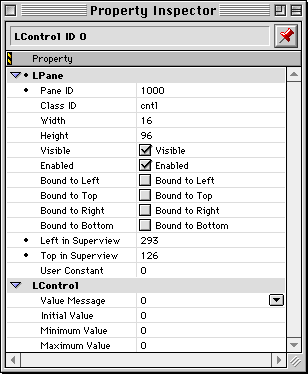
Note that a control has all the same information as a pane, including location, size, pane ID, class ID, binding, and state information. Remember, when you derive your own classes you must change the class ID to your own unique value and register the class with PowerPlant before creating any objects of that class.
Figure 8.2 is the Property Inspector window for an LControl object. You would typically use one of the specific controls such as LButton or LStdRadioButton. Each control object has its own properties. We'll discuss the individual controls in "Specific Control Classes."
Remember, the general process for creating any control object with Constructor is: drag the item into the view, then set its characteristics.
"Register PowerPlant Classes."
The typical approach used when creating a control object on the
fly is to define an SPaneInfo structure to describe the pane-related features. You then call
the appropriate constructor with the SPaneInfo and additional parameters specific to the type of control. The
LScroller::MakeScrollBars() function is a good example of creating a control object on the
fly.
Each control class has specific constructors of course. Refer to the PowerPlant Reference for details on the various constructors and the parameters you must provide to successfully create a control object on the fly.
After you have created a control and installed it in a view, you
should call FinishCreate(). This function ensures that the pane's state (visible/invisible,
active/inactive, enabled/disabled) matches its superview. It also
calls FinishCreateSelf(). The FinishCreateSelf() function gives you the opportunity to provide "finishing touches"
when creating a pane or view, because there may be times when
you can't fully initialize a pane in its constructor.
If you are creating control objects on the fly, it is your responsibility to maintain the correct visual hierarchy. You must install your control in a view. If the control you are creating is or derives from LStdControl, there is one additional requirement. The current port must be the window into which you are installing the view. To ensure that it is, you can use code similar to that in Listing 8.1.
Establishing the port for an LStdControl:
// install myControl into myView
myView->EstablishPort();
myControl->PutInside(myView);
"Creating a pane on the fly" for more on the SPaneInfo structure.
When you derive a class from LControl or one of its descendants,
you typically define a destructor and several constructors: a
default constructor, a constructor to build the control from an
SPaneInfo structure and other parameters, a constructor to build the control
from a stream, and a copy constructor. For more on stream constructors,
see "Stream constructor."
PowerPlant provides most of the controls you'll ever need in an application for the Mac OS. If you use custom controls, you'll have to derive classes to describe their behavior properly.
However, the most typical reason you would derive your own control class is because you want a control to listen to a message from some other control. For example, you may have a check box that, when turned on by the user, causes other controls to become enabled.
There are a couple of strategies you can use to accomplish this goal. You may have the view that contains the check box listen to a message, and then enable the necessary controls. A more direct approach (and one that doesn't require the view to know about its contents) is to make the dependent controls listeners to the check box. When the check box broadcasts the appropriate message, the dependent controls can enable themselves.
In order to make a control a listener, you must derive a class from some PowerPlant class in the LControl hierarchy, and mix in the LListener base class. We'll talk about how to use a listener in "Being a Good Listener."
When you derive a new control class, you may override whatever functions are necessary. The functions you are likely to override include:
Commonly overridden control functions:
| Function |
Purpose |
|---|---|
The HotSpotAction() and HotSpotResult() functions are empty in LControl, but defined in subclasses of
LControl. You may also need to override the value and descriptor
accessors if your control class uses those features in non-standard
ways.
"Creating a control on the fly" for more on the SPaneInfo structure.
Controls are just another form of pane, so drawing works the same
way as it does for panes. In most cases, the default behavior
provided in PowerPlant will suffice for your needs. Draw() performs housekeeping details and calls the control's DrawSelf() function.
You may override the DrawSelf() function if necessary to do drawing specific for your own control
classes. For example, the LCicnButton class uses the Mac Toolbox
call PlotCIcon() to draw itself.
In this section we talk about the control-related functions you use to manage values, the descriptor, and the hot spot.
Control objects have accessor functions to manipulate the contents of the various values in a control. Table 8.3 lists the functions.
Control value management functions:
| Function |
Purpose |
|---|---|
For those control classes that use the descriptor feature, you
have the same accessors available as for any pane. Predictably,
they are GetDescriptor() and SetDescriptor().
This may be the trickiest part of managing a control. Happily, if you stick with the standard PowerPlant classes, you can forget all about it. If, however, you want to create custom controls, you should be aware of the control functions that relate to hot spots. Table 8.4 lists the functions.
Hot spot management functions:
| Function |
Purpose |
|---|---|
Examine the PowerPlant classes to see how they implement these
functions. For example, the PointInHotSpot() routine typically calls PointIsInFrame() to do the real work, so consider that routine as well when implementing
custom control behavior.
In this section and the next section we discuss the PowerPlant messaging system of broadcasters and listeners. In this section we accomplish two goals. We talk about broadcasting in general, and how control objects broadcast.
LBroadcaster is a simple class. It has only a few functions, and they are easily understood. Table 8.5 lists all the member functions except constructors and the destructor.
Some LBroadcaster member functions:
| Function |
Purpose |
|---|---|
That's all there is to LBroadcaster. However, hidden inside this simplicity is great power. The basic operations are simple. You can add or remove listeners, start or stop broadcasting, and broadcast a message.
Of course, any broadcast implies that someone is listening at the other end. You must explicitly connect listeners to broadcasters.
Whenever you have an individual listener that you want to connect
to a broadcaster, you simply call the broadcaster's AddListener() function.
This can be a trifle tedious when you have a single listener that listens to several control items. For example, a typical dialog box (LDialogBox inherits from LListener) may contain many control items to which it listens.
PowerPlant has a mechanism you can use to connect a listener to
a set of controls, UReanimator::LinkListenerToControls().
You pass three parameters to this function. The first is a pointer to the listener object you want to attach to the controls. The second is a pointer to the view object that contains all the controls. (All controls must be in a single visual hierarchy). Finally, you pass the resource ID number of a special kind of PowerPlant resource, the RidL resource.
RidL stands for Resource ID List. A RidL resource is a list of one or more LControl or LControl inherited classes pane IDs.
Constructor creates a RidL resource automatically for every window that contains controls. The ID number of the RidL matches the ID number of the corresponding PPob resource created for the window. The RidL resource lists every control object in the window with a non-zero pane ID.
 WARNING!
 If you use Constructor to edit a window or view that has no controls, Constructor deletes any RidL with the matching ID. If you edit a window with controls, Constructor replaces any existing RidL with the default list of all controls in the window.
You cannot see or edit the RidL in Constructor. If you wish to make a custom RidL resource, or edit an existing resource, you must use ResEdit or Resorcerer. You can use custom RidL resources to link a listener to an arbitrary set of controls, as long as all controls are in a single view hierarchy.
So, you have two methods of linking a listener to a set of control
objects. You can use AddListener() for each control. Or you can use LinkListenerToControls() to link a listener to multiple controls in a single view hierarchy.
What about the converse situation, where you want to add a series
of listeners to a single control? There is no batch method for
accomplishing this task. You call AddListener() separately for each listener. However, a control with multiple
listeners is an uncommon situation. Most broadcasters have very
few listeners.
"RidL Resource" for more on the RidL resource.
You can turn a broadcaster on or off using the LBroadcaster functions
StartBroadcasting() and StopBroadcasting(). You inquire about the state with IsBroadcasting(). If broadcasting is off, calling BroadcastMessage() has no effect.
Assuming that broadcasting is on, when you want the broadcaster
to send a message you call BroadcastMessage(). You should never need to override this function. BroadcastMessage() walks through the broadcaster's list of listeners, and calls
each listener's ListenToMessage() function. The broadcaster sends two parameters: a 32-bit number
of type MessageT, and a void pointer.
Typically the first parameter is a value defined either by you
or PowerPlant that describes the nature of the message, or the
nature of the broadcaster. For example, PowerPlant defines the
value msg_ControlClicked and sends that message when certain controls are clicked. You
can send constants of type CommandT as well as MessageT, so you can broadcast commands directly to
listeners.
The second parameter is the void pointer. It may be nil, or point to data or an object. You are free to pass whatever associated information is necessary for the listener to appropriately respond to your message.
the topic PP_Messages.h in the PowerPlant Reference for a list of defined commands and
messages.
Controls have a separate broadcasting function that goes by the
name LControl::BroadcastValueMessage(). Although related to the messaging system, this is not inherited
from LBroadcaster. This is a function unique to controls.
BroadcastValueMessage() is a wrapper function for LBroadcaster::BroadcastMessage(). The typical control sends two values to its listeners. The first
is the control's mValueMessage data member (the message), which contains a value you define.
The second parameter is the current value of the control-the mValue data member. The BroadcastValueMessage() simply calls BroadcastMessage() with these parameters.
However, there is nothing in this arrangement that prevents a
control from calling BroadcastMessage() directly. Several PowerPlant control classes do just that. For
example, the LStdRadioButton::SetValue() function calls BroadcastMessage() to pass the msg_ControlClicked and a pointer to the radio button.
Clearly, then, the PowerPlant messaging system is extremely powerful. You can modify the listener list at any time, send any message you want, and send the listener a pointer to any data. However, for all this to work someone must listen for and respond to the messages.
Although PowerPlant's control classes do not inherit from LListener, this is a good place to discuss listeners in general. For one thing, listening is the other half of broadcasting. You can't have one without the other.
Secondly, it is a fairly common practice to derive your own control classes and have them inherit from LListener. Such a control is both a broadcaster and a listener.
The LListener class, like LBroadcaster, is a mix-in class. Use it to add listening capabilities to an object. Again like LBroadcaster, LListener is a very simple class. Table 8.6 lists the important functions of a listener.
Some LListener member functions:
| Function |
Purpose |
|---|---|
LListener is an abstract class. You cannot create an LListener
instance. You must inherit from it and override the ListenToMessage() function.
All broadcaster-listener links should be made through the broadcaster,
not the listener. Use LBroadcaster::AddListener() or UReanimator::LinkListenerToControls(), as discussed in "Linking broadcasters to listeners."
You may have noticed that Table 8.6 does not list any functions that manage the link between a listener and a given broadcaster. Such functions do exist, but they are private member functions that you should never call directly.
The ListenToMessage() function is the important part of any listener, and the only
function you are likely to override. This function is typically
called by broadcasters, but you can call ListenToMessage() directly at any time if you want a listener to respond to some
message. This will ignore the listener's on/off state however.
The typical ListenToMessage() function identifies the nature of a message and then responds
accordingly. If the listener may receive a variety of messages,
you typically see a switch statement or some other flow-control mechanism that branches
to the code designed to respond to each message. LRadioGroup::ListenToMessage() is a good example. Listing 8.2 shows how that function controls the flow based on the received
message.
Excerpt from LRadioGroup::ListenToMessage():
switch (inMessage) {
  case msg_BroadcasterDied:

    break;

  case msg_ControlClicked:

    break;
}
When you declare a class that inherits from LListener, you must
define the ListenToMessage() function. You decide what messages the listener should respond
to, and write the code to handle the message. If you don't want
to handle a message, you can just ignore it. There is nothing
in PowerPlant that says you must respond to every message received.
Let's close our discussion of control objects with a quick look at the various control classes and at the LRadioGroup class. The specific classes we discuss are:
Note that the LStdControl classes use the Mac OS Control Manager to accomplish much of their work. The other control classes do not.
LButton is a button that uses a graphical element as the visual representation of the button. The graphic is stored as a resource. The resource type may be one of these three options:
When you create the object, you provide two resource ID numbers. One is for the graphical element in its "normal" or non-pushed state. The other is for the graphical element you want to use when the user clicks or "pushes" the button.
If you use the ICN# resource as the basis for your graphical button, the Mac OS automatically picks the icon family member that best matches the display settings of the monitor on which it appears.
Although typical buttons are fairly small, and both ICON and ICN# resources describe images with specific dimensions, you can use a large PICT as a button.
Figure 8.3 displays the LButton-specific options you encounter in Constructor.
LButton properties in Constructor: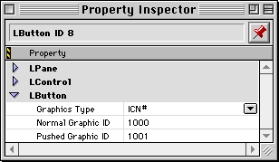
You also set the usual pane and control characteristics such as the message, minimum, maximum, and initial values, and so forth.
When the user releases the mouse within the button, the button sends a message to its listeners. The value message depends on your application.
This class is effectively identical to LButton, with one exception. It uses the Mac OS `cicn' resource format as the graphical element. As with the LButton class, you provide resource ID numbers for the button in both normal and pushed state.
The LToggleButton class is similar to LButton. It represents a graphical button using ICON, ICN#, or PICT graphics. Rather than being limited to "on" and "off" graphics, you may specify five separate resource ID numbers. Figure 8.4 illustrates the options.
LToggleButton properties in Constructor: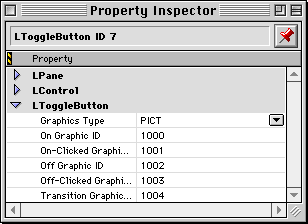
In addition to the regular on and off graphics, you have graphics for a click on a button that is already on, a click on a button that is already off, and a transition graphic that displays when the button is switching states.
You can use an LToggleButton to create some simple but intriguing animations that display when the user clicks a button. For example, you could create a drop-down flag button, or a door that opens and closes.
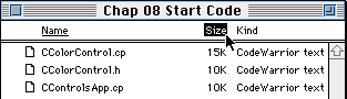
LTextButton describes a button with textual rather than graphical content. There is no standard Mac OS control item that matches LTextButton's behavior. However, you've seen similar controls in action. Figure 8.5 shows how the Finder uses a similar type of control as column titles in its list views.
In Figure 8.5, the column titles are in fact text buttons that control sort order for the items in the window. The current sort order is by name-the "on" button appears in underline style. The user is clicking on the Size button and is about to change the sort order.
Figure 8.6 shows the specific LTextButton characteristics you set using Constructor.
LTextButton properties in Constructor: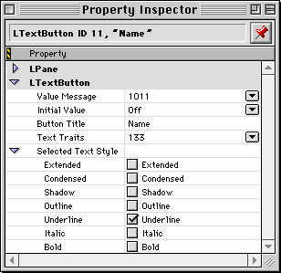
Like all PowerPlant text-related objects, you specify the style of text in a text traits resource.
Clicking an LTextButton toggles the button's state between on and off, like a radio button. The different state is represented visually by a change in the text style. The button style may become underline, bold, italic, outline, shadow, condensed, extended, or any combination of those style options.
Like other buttons, when the user clicks on an LTextButton the button sends a message to its listeners. In a typical scenario, you want some action to occur immediately when the user clicks a text button-for example, resorting the contents of a window. In that case, you should specify a value message that uniquely identifies the button to any listener. That way you'll know what button was clicked.
A series of LTextButton objects typically represents a set of mutually exclusive options. If that's how you use text buttons, then you should use the LRadioGroup class to ensure that one and only one button in the group of buttons is on.
This class encapsulates the standard behavior of a Mac OS control item. The specific design of this class supports scroll bar controls and controls that use custom control definitions (CDEFs). This class also forms the basis for the standard button, check box, popup menu, and radio button classes.
NOTE The LStdControl.cp file defines the functions for all the standard controls-radio buttons, check boxes, etc.
Figure 8.7 illustrates the characteristics you set for a standard control using Constructor.
LStdControl properties in Constructor: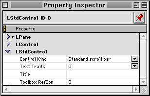
If you create a custom control with its own control definition function (CDEF), you specify the CDEF in the Control Kind field.
This class is PowerPlant's implementation of standard Mac OS push button behavior. You specify the text to display, a text traits resource ID, and the message to send when clicked.
LStdButton properties in Constructor: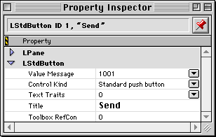
You do not need to specify a minimum or maximum value, because buttons have no real value. They simply highlight and send a message when clicked.
LStdButton does not draw the default-button outline. That detail is typically handled transparently for you by PowerPlant. View classes that have a default button-such as LDialogBox-let you specify a default button. PowerPlant uses the LDefaultOutline class to manage the process.
This class is PowerPlant's implementation of a standard check
box. It is a very simple class. The only function of LStdControl
that it overrides is HotSpotResult(). If the user clicks this control, the control's value toggles
between zero and one. Figure 8.9 displays the characteristics of an LStdCheckBox.
LStdCheckBox properties in Constructor: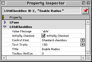
This class is PowerPlant's implementation of the standard Mac OS popup menu. Once again, the PowerPlant wrapper hides virtually every detail of the Mac OS from your view, freeing you to concentrate on real coding problems.
Figure 8.10 shows you the many characteristics specific to a popup menu that you can set using Constructor.
LStdPopupMenu properties in Constructor: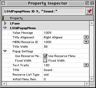
Like many controls, you specify a title. The text traits resource ID applies to the entire menu-the items in the menu as well as the title. To specify unique style features for the title, use the check boxes in the Title Style group.
The title width is subtracted from the full width of the frame. If the Fixed Width option is on, menu items display in the remaining space. If it is off, the width of the menu is adjusted to allow the longest item to fit (regardless of the frame you set).
Title Placement controls the justification of the title text within the title space. The menu title is always to the left of the menu items. Within its allotted space the title may be flush left, centered, or flush right.
You specify the initial menu item that appears when the popup is displayed.
The Value Message typically identifies the popup menu itself. You might use the pane ID as the message, for example. When the user chooses an item in the menu, the menu broadcasts a message consisting of the value message (whatever you set), and the popup menu's current value. The current value is the item currently displayed, so you know what item the user chose.
You specify the resource ID of a MENU resource to set the contents of the menu. If you want the menu to be a list of resources, you click the Resource List check box and specify the resource type. You might specify `snd ' for a menu of available sound resources, FONT for a font menu, and so forth. PowerPlant builds the menu contents for you automatically.
WARNING! If you modify the number of items in a popup menu at runtime, the LStdPopupMenu object does not automatically adjust its max value to represent the new number of items. You must do that manually.
If you use the same menu in more than one place simultaneously and change the menu, the change affects all LStdPopupMenu objects that share the same MENU resource. Remember to update all objects as necessary.
This class is PowerPlant's implementation of the standard Mac OS radio button. Like the LStdCheckBox class, this is a very simple extension of the LStdControl class.
A click on a radio button sets its value to one. The button then broadcasts a message that it has been clicked. The broadcast message also includes a pointer to the clicked button.
LStdRadioButton properties in Constructor: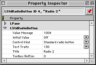
You specify a title, text traits resource ID, the value message, and an initial value.
The default behavior for LStdRadioButton does not use the value message. If you subclass from LStdRadioButton and use the value message, make sure you set its value appropriately.
In its default behavior, LStdRadioButton calls BroadcastMessage() directly with two parameters, msg_ControlClicked and a pointer to the radio button object. A listener can use
the pointer to find out anything it needs to know about the clicked
button.
If you want a listener to respond to the button immediately, you can use the LStdRadioButton pointer you receive in the message to get the pane ID or any other information you need, and then act accordingly.
You typically use radio buttons to describe a set of mutually exclusive options. Typically you set one button to have a value of On. If all the buttons are off in a group, PowerPlant will turn on the first button it encounters. If two or more buttons in a group are on, PowerPlant will turn off all but the last on button.
The LStdRadioButton class itself has no feature for grouping radio buttons, or for turning off other radio buttons in a group when a new button is turned on. That detail is handled by LRadioGroup.
TIP You can use the LRadioGroup class to manage groups of LTextButtons as well as LStdRadioButtons. A group of either kind of button represents a mutually exclusive set of options.
To create an LRadioGroup in Constructor, you first select a group
of radio buttons. Then you choose Make Radio Group from Constructor's Arrange menu.
No visible item appears in the layout window, but you can see the radio group in the hierarchy window, as shown at the bottom of Figure 8.12.
Radio group in the hierarchy window: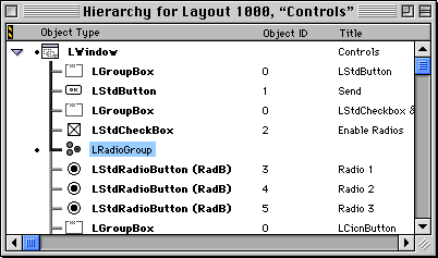
Membership in the radio group is based on the pane ID number of each radio button.
NOTE The position of the radio group within the hierarchy is not important. It can come before or after the buttons in the group. However, if you rearrange the position of a radio button in the object hierarchy, the radio group will lose track of the button.
LRadioGroup works with LStdRadioButton and LTextButton. To use
another kind of button with LRadioGroup (LToggleButton for example),
override the button's SetValue() function so that the button broadcasts the msg_ControlClicked message. Use LStdRadioButton::SetValue() as an example. If the button does not broadcast this message,
it will not be mutually exclusive.
Once again, you have just consumed a tremendous amount of information about PowerPlant. In this chapter you learned all about control objects and the PowerPlant messaging system.
Controls give the user choices for controlling the behavior of your application. PowerPlant supports about 10 different kinds of controls, including standard Mac OS controls and custom controls.
A control is a special kind of pane that is also a broadcaster. A control uses several additional values to keep track of its status, as well as the descriptor feature of the pane to manage the control title. Controls have "hot spots" and respond when the user clicks the hot spot. In most cases, a control has a single hot spot whose dimensions are identical to the control frame.
You learned how to create and display a control, how to manage a control's various characteristics, and how to respond to a click in a control.
In response to a click, a control broadcasts a message. You learned about the features of both LBroadcaster and LListener-what they do, how they work, and how to link one with the other. You also learned how controls manage broadcasting.
Finally, you learned about each specific control class. You saw examples of typical uses, and studied the kinds of features each class adds to the base control classes in PowerPlant.
Now let's put that knowledge to work and create real controls in PowerPlant.
In this exercise you build an application titled "Controls." A PPob containing most of the controls is provided for you. You complete the interface, and then write the code necessary to make the controls work. This code exercise has three sections in which you implement
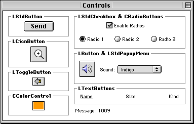
The final application looks like Figure 8.13, below.
When you click on a control, it sends a message to its listeners. This window displays the message. Several of the controls perform actual functions as well. For example, the button next to the sound popup menu plays the selected sound. The CColorControl in the bottom left corner changes colors.
There are thirteen controls in this window. Open the Controls.ppob file and examine the control characteristics with Constructor
as you read the following descriptions.
None of the controls are bound to the superview-the window. This window does not resize, so binding is not an issue.
The LStdButton is a standard PowerPlant object. It has a value message of 1001. It uses no text traits resource, which means it uses the System font.
The LStdCheckBox is a standard PowerPlant object. It has a value message of "able"-a text message. It uses text traits resource 130.
The three radio buttons are custom controls. They are standard radio buttons that are also listeners. They listen to the check box so they can enable or disable themselves as necessary. They have value messages of 1003, 1004, and 1005 respectively. Notice that the class ID is RadB. You have already built a custom pane and view, so you know the importance of the class ID.
Open the Constructor hierarchy window, and look for an LRadioGroup object. In fact, you'll find two. One LRadioGroup is for objects 3, 4, and 5-these three radio buttons. The other is for objects 11, 12, and 13. These are the LTextButton objects. We'll talk about them in just a bit. The LRadioGroup button makes sure that one and only one control of its set of controls is on.
The LCicnButton is a regular PowerPlant object. It has a value message of 1006. It uses two cicn resources, ID number 1000 for its normal state and ID number 1001 for pushed state. These icons are provided for you in the application resources.
The LToggleButton is another regular PowerPlant object. It has a value message of 1007. It uses a series of five PICTs for the button image, numbered 1000-1004. These PICTs are provided for you in the application resources.
The LButton and LStdPopupMenu objects are regular PowerPlant controls. The LButton uses an icon family with resource ID 1000, provided for you in the application resources. It has a value message of 1008. The LStdPopupMenu uses MENU ID 1000, and text traits resource 130. It has a value message of 1009.
The three LTextButton objects are regular PowerPlant controls. The value messages are 1011-1013 respectively. Each uses text traits resource 130. There is an LRadioGroup object to control these buttons.
The CColorControl is a custom control derived from LControl. It also stores additional data, so it is a "custom type" in Constructor. You'll build this object in a little bit. It does not exist in the PPob in the start code.
Finally, there are 7 LGroupBox objects that we discuss no further, and two captions. One caption says "Message." The other caption is blank. You'll write code to display the message received by the listener in this blank caption.
To complete the interface, you
If you have not already opened the PPob project file, double-click
the Controls.ppob file in the IDE project window. Constructor launches and the
Constructor project window appears. Double-click the LWindow view
to see its contents, and then double-click the menu item control.
The Property Window for the LStdPopupMenu object appears. Most
of the data has been set for you.
LStdPopupMenu popup properties: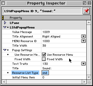
This menu contains a list of sound resources. Check the Resource List Type box, and enter the name of the type of resource you want to appear
in the menu. In this case, it is "snd "-with a trailing space.
This is the name of the resource type for sounds.
With that information set, PowerPlant will build the menu for you. You must still provide a MENU resource, but the MENU resource should be empty.
Close the Property Inspector window and save your changes.
2. Build the CColorControl object.
The CColorControl object is a custom pane type. It is a control, but it requires additional data. If you want to be able to set that data in Constructor in the Property Inspector window, you must create a CTYP resource for this custom pane.
You must create the CTYP resource, specify class information, specify the additional data items that appear in the Property Inspector window for this custom pane, add the object to the window, and set the object's characteristics.
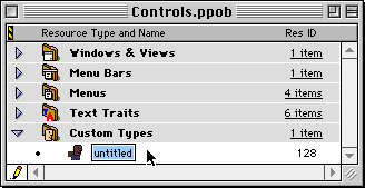
While in the Constructor project window, select the Custom Pane
Types heading, then choose New Resource (command-K) from the Edit menu. Constructor builds a new, untitled custom pane type resource
(CTYP), as shown in Figure 8.15.
With the new resource selected as shown, set the resource name to CColorControl. The ID should remain 128.
b. Edit the class information.
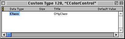
Double click the CColorControl resource in the project window. The CTYP editor window shown in Figure 8.16 appears.
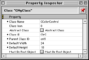
Now, double-click the Class to set the new class's ancestor and other data. When you do, the window shown in Figure 8.17 appears.
Set the data to match the illustration. Set the name, class ID, parent class ID, default height and width.
Close the window after you have made the changes.
c. Add data to the custom type.
This control stores a color. To allow yourself to set a color in this custom class's Property Inspector window, you add the necessary data item to the CTYP resource.
With the CTYP editor window active, choose New RGB Color Item from the Custom Type menu. Then double-click the new item to set its properties.
Setting a new RGB Color properties:`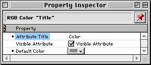
Set the title to Color. The title is the label that will appear next to this item in the Property Inspector window for the custom pane. You can also pick a default color if you wish.
When you have set the data, close the CTYP editor window.
d. Add the object to the window.
Double-click the PPob resource to open the layout editor. Make sure you also have the Catalog Window open as well, and showing the control classes. The CColorControl pane type should appear in the Catalog window.
Drag a CColorControl object into the layout.
e. Set the object characteristics.
Double-click the new CColorControl object in the layout window. The Property Inspector window should appear, as shown in Figure 8.19.
CColorControl Property Inspector: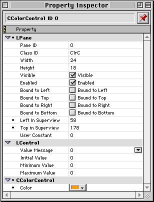
There is an item for the new data type you entered, the RGB Color. Set the characteristics of the pane to match the values in the illustration. Pay particular attention to the class ID and value message. You can set an initial color by clicking the color box.
Congratulations! You have just created a custom Constructor type. When you create a CTYP resource, you are really creating a template that Constructor can use for any number of objects of that particular class. You can copy and paste CTYP resources from project to project. So you can use your custom Constructor types in any project.
You must still write the code to implement this custom object as well as the other controls. That's what you'll do in the next steps.
In this section you implement the functions for CColorControl. The header for the CColorControl class is complete. It sets the class ID and declares the various functions. In the following steps you implement these functions:
CColorControl(LStream*)
SetColor()
DrawSelf()
FindHotSpot()
PointInHotSpot()
HotSpotAction()
HotSpotResult()
The remaining constructors and destructor have been provided for you. There is a class creator function as well. It simply calls the stream constructor.
This is a long exercise, so don't forget to save your work often.
3. Implement the stream constructor
CColorControl(LStream*) CColorControl.cp
When you created the custom type, you added some extra data-an
RGBColor. You must read that data out of the stream and initialize
the related data member. The header for this class names the data
member as mColor. We discuss streams in "What Is a Stream."
The existing code calls the LControl stream constructor.
CColorControl::CColorControl( LStream *inStream )
    : LControl( inStream )
{
  // Initialize the color from the stream.
  inStream->ReadData( &mColor, sizeof(RGBColor) );
}
4. Write the SetColor() accessor.
This function receives the color as an input parameter. It should
do two things. It should set the mColor data member, and update the control. You should refresh the control
whenever the color changes to ensure that it reflects the current
state of the object.
By the way, the GetColor() accessor is provided for you.
CColorControl::SetColor( const RGBColor &inColor )
{
  mColor = inColor;
  // Refresh control to reflect color change.
  Refresh();
}
Every pane has a DrawSelf() function. Controls are no exception. This control draws a black
frame, leaves a one-pixel white space, and then fills the rest
of the control with the control's color. Of course, you should
preserve the color state and set it to known values before drawing.
CColorControl::DrawSelf()
{
  // Save and normalize the color/pen states.
  StColorPenState savePenState;
  StColorPenState::Normalize();

  // Calculate the frame rect.
  Rect theFrame;
  CalcLocalFrameRect( theFrame );

  // Frame the control.
  ::FrameRect( &theFrame );

  // Draw a white area inner frame.
  RGBColor theWhiteColor = {0xffff,0xffff,0xffff};
  ::RGBForeColor( &theWhiteColor );
  ::InsetRect( &theFrame, 1, 1 );
  ::FrameRect( &theFrame );

  // Fill in rest of control with the color.
  ::RGBForeColor( &mColor );
  ::InsetRect( &theFrame, 1, 1 );
  ::PaintRect( &theFrame );
}
FindHotSpot() CColorControl.cp
PowerPlant uses this function to determine which hot spot, if any, contains the specified point. The CColorControl object has only one hot spot, the colored area of the control. If the point is inside the hot spot, return the value 1. Otherwise, return the value zero. The colored area is inset two pixels from the frame of the control. The function receives the point in question.
CColorControl::FindHotSpot( Point inPoint )
{
  SInt16 theHotSpot = 0;
  // Calculate the frame rect.
  Rect theFrame;
  CalcLocalFrameRect( theFrame );

  // Inset to get the colored interior region.
  ::InsetRect( &theFrame, 2, 2 );

  // Check if the point is in our hot spot.
  if ( ::PtInRect( inPoint, &theFrame ) )
    theHotSpot = 1;

  return theHotSpot;}
7. Determine if a point is in the hot spot.
PointInHotSpot() CColorControl.cp
PowerPlant uses this function to determine if a point is inside a particular hot spot. The function receives the point in question, and the number of the hot spot.
The CColorControl object has one hot spot, the colored area of the control. The colored area is inset two pixels from the frame of the control. You should return true if the hot spot is number 1, and the point is inside the control's hot spot.
CColorControl::PointInHotSpot( Point inPoint,
                              SInt16 inHotSpot )
{
  Boolean theResult = false;

  // Calculate the frame rect.
  Rect theFrame;
  CalcLocalFrameRect( theFrame );
  // Inset to get the colored interior region.
  ::InsetRect( &theFrame, 2, 2 );

  // Check if the point is in our hot spot.
  if ( inHotSpot == 1 && ::PtInRect(inPoint, &theFrame ) )
    theResult = true;

  return theResult;
}
8. Act while the button is down in the hot spot.
HotSpotAction() CColorControl.cp
PowerPlant calls this routine repeatedly while the mouse button is down inside a hot spot. The CColorControl object draws a highlight while the button is in the control, and no highlight while the button is outside of the control. A more complex control could perform a more complex action, such as scrolling a view.
This function receives three parameters: the hot spot, and two Boolean values. If these values are the same, there has been no change. If they are different, then the mouse has moved either into or out of the hot spot and you should act accordingly.
Remember, CColorControl only has one hot spot. If you get any hot spot value besides 1, you should do nothing.
Because you are drawing in the control, you should call FocusDraw() before drawing to ensure that the drawing environment is set
up properly.
CColorControl::HotSpotAction(SInt16 inHotSpot,
                      Boolean inCurrInside,
                      Boolean inPrevInside )
{
  if ( inHotSpot == 1
        && inCurrInside != inPrevInside
        && FocusDraw() ) {

    // Calculate the frame rect.
    Rect theFrame;
    CalcLocalFrameRect( theFrame );

    // Inset it to account for the frame.
    ::InsetRect( &theFrame, 1, 1 );

    // If we're inside, draw the hilight black,
    RGBColor theColor;
    if ( inCurrInside ) {
      theColor.red = theColor.green = theColor.blue = 0x0000;
    } else { // erase it with white.
      theColor.red = theColor.green = theColor.blue = 0xffff;
    }
    ::RGBForeColor( &theColor );
    // Draw the hilight.
    ::FrameRect( &theFrame );
  }
}
9. Act when the button is released in the hot spot.
HotSpotResult() CColorControl.cp
PowerPlant calls this routine when the mouse button is released inside a hot spot. The function receives a single parameter, the number of the hot spot involved.
If the hot spot is number 1, the CColorControl object should unhighlight the control. You should then display the standard color selection dialog. Set the new color and broadcast a message to all listeners that the color has changed.
CColorControl::HotSpotResult( SInt16 inHotSpot )
{
  // Only act if we're in the hot spot.
  if ( inHotSpot == 1 ) {
    // Undo hilighting.
    HotSpotAction( inHotSpot, false, true );

    // Choose a new color.
    Point thePoint = {-1,-1};
    RGBColor theNewColor;
    if ( ::GetColor( thePoint, "\pChoose a color:",
                     &mColor, &theNewColor ) ) {

      // Set the new color.
      SetColor( theNewColor );

      // Broadcast the message.
      BroadcastValueMessage();
  }
}
Save your work and close the file.
The BroadcastValueMessage() call is perhaps the single most important line of code you wrote
in this section. This is the call that tells all the listeners
that something happened.
In the remaining steps you hook listeners to controls to make everything work.
In the design of this application, there are three levels of objects with varying degrees of responsibilities. There is the application, the window, and the controls. You could make either the window or the application listen to messages.
In this case we use the application as the principal listener. CControlsApp inherits from both LApplication and LListener.
CControlsApp class declaration:
class CControlsApp : public LApplication, public LListener {
public:
            CControlsApp();
  virtual   ~CControlsApp();
  virtual void ListenToMessage( MessageT inMessage,
                                void *ioParam );

protected:
  LWindow* MakeControlsWindow();

private:
  LWindow* mWindow;
};
We discuss application objects in detail in the next chapter. Don't be alarmed about getting ahead of ourselves. Your work is really with this particular application's "listener" nature.
This application object overrides ListenToMessage() inherited from LListener, has a new function MakeControlsWindow(), and a new data member that points to the only window.
In the following steps you will:
To register any PowerPlant or custom class, you need to include the header file for that class in your main source file.
// include header for LToggleButton
#include <LToggleButton.h>
// Custom Classes to be registered
#include "CColorControl.h"
#include "CRadioButton.h"
CControlsApp() CControlsApp.cp
This application uses two custom classes, CColorControl and CRadioButton. In addition, this application uses LToggleButton. LToggleButton and the two custom classes must all be registered individually.
	RegisterClass_(LRadioGroup);
// Register additional PowerPlant classes.
	RegisterClass_(LToggleButton);

	// Register custom classes.
	RegisterClass_(CColorControl);
	RegisterClass_(CRadioButton);

mWindow = MakeControlsWindow();
The existing code also calls MakeControlsWindow() to build the window. This is where you begin the real work of
adding functionality to the application.
12. Link the application to all controls.
MakeControlsWindow() CControlsApp.cp
The existing code calls the LWindow class creator function. After that, you link the application to all controls in the window.
Remember, Constructor creates a RidL resource listing all the
controls in a window. The file ControlsConstants.h declares rRidL_ControlsWindow to match that resource ID number.
theWindow = LWindow::CreateWindow( rPPob_ControlsWindow, this );
// Link the application (the listener) with the
// controls in the window (the broadcasters).
UReanimator::LinkListenerToControls( this, theWindow,
                                     rRidL_ControlsWindow );
13. Link the radio buttons to the check box.
MakeControlsWindow() CControlsApp.cp
In the design of the Controls application, the check box enables or disables the radio buttons. To make that happen, the start code CRadioButton class inherits from both LStdRadioButton and LListener. To complete the links, you must make the CRadioButton objects listen to the check box object.
To do this, get the check box object using FindPaneByID(). Then find each radio button object in turn using FindPaneByID(). Tell the check box to add that object as a listener. The constants
listed in the source code are declared in ControlsConstants.h.
  UReanimator::LinkListenerToControls(this, theWindow,
                                      rRidL_ControlsWindow );
  // Get the check box.
  LStdCheckBox *theCheckBox;
  theCheckBox = dynamic_cast<LStdCheckBox *>
                (theWindow->FindPaneByID( kStdCheckbox ));

  // Get radios make them listen to check box.
  CRadioButton *theRadio;
  theRadio = dynamic_cast<CRadioButton *>
             (theWindow->FindPaneByID( kStdRadio1 ));
  theCheckBox->AddListener( theRadio );

  theRadio = dynamic_cast<CRadioButton *>
             (theWindow->FindPaneByID( kStdRadio2 ));
  theCheckBox->AddListener( theRadio );

  theRadio = dynamic_cast<CRadioButton *>
             (theWindow->FindPaneByID( kStdRadio3 ));
  theCheckBox->AddListener( theRadio );

theWindow->Show();
WARNING! There is no error control at all here. This code assumes that
each of the calls to FindPaneByID() returns a valid pointer and the dynamic_cast succeeds. This is not wise. In robust code you would check the
validity of the returned pointer. We'll discuss PowerPlant's debugging
features in the next chapter.
The existing code then shows the window.
14. Make the application respond to controls.
ListenToMessage() CControlsApp.cp
As you know, each listener has a single ListenToMessage() function in which it responds to messages. The CControlsApp object
is no exception. The application object should respond in two
ways.
First, for every message received, display the message in the
message caption. To accomplish this task, get the message caption
by telling the window to FindPaneByID(). The constant for the pane ID is kMessagePane. After you have the pointer to the caption, set the caption's
value, and refresh the caption so the window redraws. For an LCaption
the value is the descriptor.
Second, if the message comes from either the sound button or the sound popup menu, play a sound. To accomplish this task, identify the appropriate message. If that message is received, get a pointer to the popup menu object. Read the value of the popup menu, and play the corresponding sound.
The solution code does some of the work for you. It converts the message into a string. The code for playing the sound already exists as well. You do the work in between. Make sure you use the same local variable names as the solution code where necessary.
#pragma unused( ioParam )
// set message in message pane
LCaption* theCaption = dynamic_cast<LCaption*>
                        (mWindow-> FindPaneByID(kMessagePane));
ThrowIfNil_( theCaption );
theCaption->SetValue(inMessage);
theCaption->Refresh();

switch ( inMessage ) {
// identify sound messages
  case msg_PlaySoundButton:
  case msg_SoundPopup:
  {
    // Get the popup menu.
    LStdPopupMenu *thePopup;
    thePopup = dynamic_cast<LStdPopupMenu *>
               (mWindow->FindPaneByID( kStdPopupMenu ));

    // Get the name of the sound to play.
    Str255 theSoundName;
    ::GetMenuItemText( thePopup->GetMacMenuH(),
                       thePopup->GetValue(), theSoundName );
The existing code then gets and plays the sound resource.
Save your work and close the file.
15. Make the radio buttons respond to the check box.
ListenToMessage() CRadioButton.cp
The radio buttons listen to any message from the check box. In
fact, the check box sends one message. The ControlConstants.h file declares msg_EnableDisable to match the "able" message specified in Constructor.
The radio button receives this message whether the check box is turning on or off. When the radio button receives this message, check the state of the radio button. If it is enabled, disable it. If it is disabled, enable it.
switch ( inMessage ) {  // identify and respond to message
  case msg_EnableDisable:
    if ( IsEnabled() ) {
      Disable();
    } else {
      Enable();
    }
    break;
Save your work and close the file.
Great news! You have completely implemented a custom control, linked an application to a set of controls, and linked some controls to another control. Let's watch how it all works.
16. Build and run the application.
Make the project and run it. When you do, a window should appear containing all the views. See Figure 8.13. Play with the controls in the window and watch what happens.
Click on each control. Watch the message that's displayed near the bottom of the window. Feel free to check in Constructor to see how the messages match the value message. If you're careful, you're going to notice an interesting fact.
The message received when you click on a radio button or a text
button is not the value message! The default behavior for these
controls broadcasts the msg_ControlClicked value, which is 203. The PowerPlant_Messages.h file declares this constant.
Click the check box and observe the message. The number is the numerical representation of the "able" message. Notice how the radio buttons respond to the check box. This is your code at work.
Choose a sound from the sound popup menu. The sound should play. The application hears the message and responds. Click in the sound button. The sound should play again.
Click the LToggleButton. Observe how the picture in the button changes. PowerPlant steps through the series of graphics provided for the button. Observe similar behavior when you click the LCicnButton. Here you have two states, pushed and not pushed.
Finally, don't forget the CColorControl. After all the work you did writing the code for that class, you might as well get some enjoyment out of it. Play with the control. Click and hold the mouse button down while moving the mouse in and out of the control. Highlighting should turn off and on appropriately. Click the control, and the standard color picker dialog should appear. Pick a color, and the button should change to reflect your choice.
Notice that the application receives the message from the CColorControl object. Stop and think about what you've got here. You now have a ready-made PowerPlant class that you can drop into any PowerPlant project any time you need a control to select a color. Because it broadcasts a message, any dependent object that listens to the message can change its color in response. Cool! This could be really useful.
If you would like to experiment further, here's a suggestion. Notice that if you use the sound popup menu and choose the current sound (that is, you make no change in the menu), the sound does not play. That's because the default behavior for the menu does not send a message unless the popup menu changes. If you wanted to use this in a real application, you might want to modify that behavior so that a sound plays when the user chooses the current item in the menu. You'll have to subclass LStdPopupMenu to make this happen. If you're feeling adventurous, don't let that stop you. Go for it, and have a good time.
Well done! You have done some serious PowerPlant programming. You have not only learned all about controls, you have also finished the Basic Building Blocks section of the manual. It's time to take a breather and look at where you've been, where you are, and where you're going to go in the rest of the manual.
In the first section of the manual you learned the fundamentals of application framework design. You got a broad panorama of framework architecture. You learned about design patterns, and how PowerPlant implements those patterns in a carefully-crafted Macintosh application framework. You also learned that an application framework is first and foremost a mechanism for managing the visual interface in an application.
In the Basic Building Blocks section that you have just finished, you learned all about the fundamental building blocks you use to build a visual interface in PowerPlant. You have mastered panes, views, and controls. You know how they relate to each other, how to create them, how they are typically used, and what they're good for.
That's a lot of knowledge! Take a look at Figure 8.20 to get the big picture. We haven't talked about all of these classes in detail, but we have discussed most of them.
In the process we have spent a fair amount of time deep in the details of code. Every now and then you got a glimpse of the higher principles being implemented, like the messaging system. And that has helped you keep the big picture in mind.
In the next section of the manual we're going to talk about how a PowerPlant application really works. We'll start with the command hierarchy. Then we're going to return to the visual hierarchy again. Only this time, rather than talking about the fundamental building blocks, we're going to put those blocks together in windows and dialogs.
Then we'll discuss other application tasks, like file I/O and printing. Along the way you're going to see and learn a lot more about PowerPlant.